B
Voyager
The official lemmy community for Voyager, an open source, mobile-first client for lemmy.
Rules
- Be nice.
- lemmy.world instance policy
Sponsor development! 👇
💙
B.
C is my favorite, however, I have grown fond of the original icon, will we be able to choose? Thanks for all you do! Voyager is the BOMB!
B!
I don't like any of them. That said, I voted for C. It's kinda plain, but that's what I like about it. The other ones are too messy.
B is my first choice. Most similar to what I used for Apollo. Second choice would be c.
Definitely B
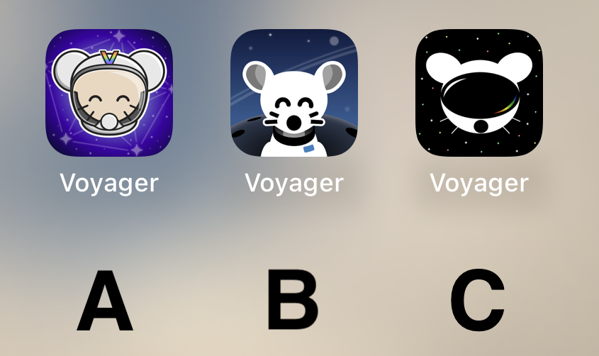
I like the idea of A, but as a Designer, B’s execution is way better and cleaner. Cohesive style, and very fitting for iOS. Sad that A is too cartoony. C is weird, the mouse is flat, and the “visor” (that looks like a huge mouth) is very detailed… don’t like it.
So, B, definitely.
Voted C. It's by far the most robust option. It looks stylish, professional, and could easily accommodate a flat, 1-color design.
B
All are very good, but B takes the cake for me personally.
B
C looks like Daft Punk mouse
C
Really like A! Good job to all participants though!
B 100% !!! It's so cute
I like the background of B the best. But it looks more like a dog and it's throwing me off. I like the character of the first one better, especially with the V on the helmet.
So I think I'm voting for A
B. A is also good. Don't like C at all.
C mouse with A background please
I can't decide between A and C... I am gonna go for C I guess.
BTW can we have different icons like Apollo had?
I like A a lot, reminds me of the early iPhone days of tasteful skeumorphism.
B is probably my favorite tho -- definitely the cleanest.
C looks off to me, something about the goggles.
B
B, but the planet in the background makes it look like extremely large shoulders.
Quick comparison on Android (custom launcher): https://i.ibb.co/XVnM2NL/comp.png
Definitely B
i vote for B cuz i think it's the cutest 🐭
C
I will be happy with either b or c
B Please! Looks so very clean.
B with the helmet of A (minus the “V”)
A looks like something an elementary school aged kid would have on their iPad for help learning to add.
B's got my vote.
Initially I liked the background on A and the lemmy on B....
....but I think C has my vote just for the sheer symbolism it projects - a confident lemmy ready to boldly venture into the future fediverse.
A and B has too many details for an app icon that isn’t for a game.
B gang
B my lord
C


