this post was submitted on 05 Jul 2025
179 points (98.4% liked)
Saturday Morning Breakfast Cereal
818 readers
158 users here now
Posts and discussion about the webcomic Saturday Morning Breakfast Cereal by Hugo Award-winning author Zach Weinersmith (and related works)
https://www.patreon.com/ZachWeinersmith
@ZachWeinersmith@mastodon.social
New comics posted whenever they get posted on the site, and old comics posted every day until we catch up in a decade or so
founded 8 months ago
MODERATORS
you are viewing a single comment's thread
view the rest of the comments
view the rest of the comments
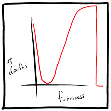
Why not?
For graph charts, dependent data goes on the y-axis; independent data on the x-axis.
Yeah but why can't a death count have two levels of funniness?
The chart should be somewhat descriptive in the correlation, and usually processing in intensity. The single death count having two different levels of funny isn't really explained by the chart, which isn't a real statistical analysis which might have odd data points like that, but instead is an extra joke.
As a joke, it doesn't portray itself well if the axies aren't swapped. When swapped, the joke is pretty obvious and understandable.