this post was submitted on 08 Nov 2023
307 points (97.8% liked)
Don't Dead - Open Inside
1637 readers
1 users here now
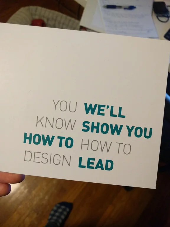
Images of text-designs, that are barely readable due to the placement of the words or letters
Please indicate which post is original by writing "OC" and properly credit stolen posts.
Please mark NSFW posts properly, don't spam, yadadadada
founded 2 years ago
MODERATORS
you are viewing a single comment's thread
view the rest of the comments
view the rest of the comments
If the "how to"s were swapped it'd still be pretty "don't dead", but at least vaguely sensible. No idea what the fuck they were going for with that swap
It's still not fantastic, but it is better.
It's worse; it's plain and boring. Nothing about it attracts attention. The seemingly incongruous first version draws your attention.
I mean legibility, but I agree. We wouldn't even be having this conversation had it been aligned like my image.