Hey everyone! Ill be starting to share updates on the frontend visuals here like I was doing with Pangora before it got merged into Sublinks
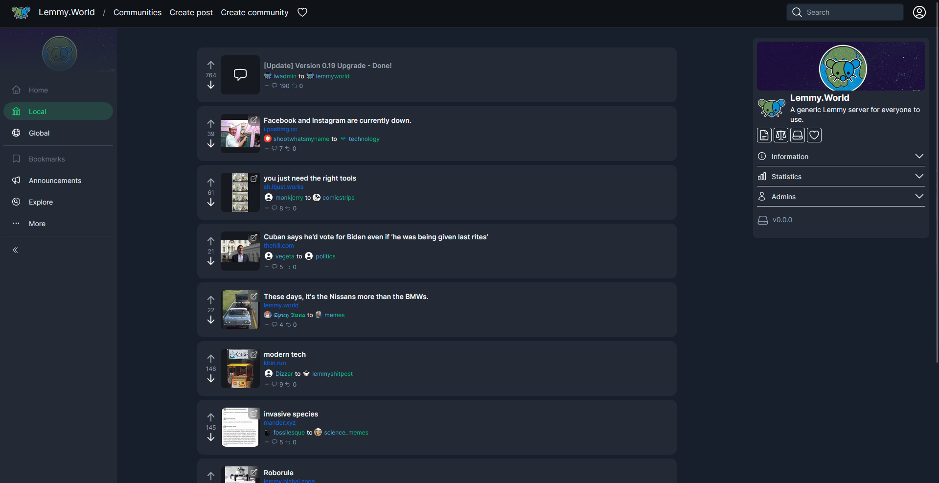
Starting off with some progress I've been making on the Home Page. Been taking things I enjoy from both alternate frontends such as Photon and Tesseract, as well as Misskey forks like Iceshrimp and Sharkey.
People who followed me as I was developing Pangora might recognize a lot of similar design decisions
Still in progress but ill try to share new progress at least every couple of days when I work on it with new additions
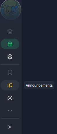
The left sidebar can be collapsed to show only icons for people who want a bit more space for post cards

Hovering over an option adds a popover saying what it is

In addition when you scroll down the navbar shrinks a bit to give you more space for post cards. On mobile the navbar hides completely when you scroll down and then shows again when you scroll up


