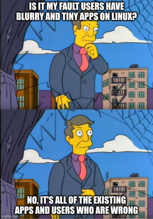
Wuuttup. I'm here complaining again about Framework's Linux unfriendly display. The new one this time.
https://frame.work/products/display-kit?v=FRANJF0001
Old display, 2256 x 1504 (3:2)
GNOME
100% scale
- Nothing looks blurry
- Everything is tiny
- Unusable
100% scale + large text accessibility
- Nothing looks blurry
- Most apps scale appropriately
- Some apps don’t respect GNOME’s large text setting (Alacritty)
125% scale
- Most apps look blurry (Picard, Firefox, Spotify, Alacritty)
200% scale
- Everything is way too big
- Unusable
Plasma
100% scale
- Nothing looks blurry
- Everything is tiny
- Unusable
125% scale + Apply scaling themselves
- Nothing looks blurry
- Most apps scale appropriate
- Some apps can’t scale themselves and look tiny (Picard)
125% scale + Scaled by system
- Most apps look blurry (Picard, Firefox, Spotify, Alacritty)
200% scale
- Everything is way too big
- Unusable
New display, 2880 x 1920 (3:2)
GNOME
100% scale
- Nothing looks blurry
- Everything is tiny
- Unusable
100% scale + large text accessibility
- Nothing looks blurry
- Most apps scale appropriately
- Some apps don’t respect GNOME’s large text setting (Alacritty)
- Everything is tiny
150% scale
- Most apps look blurry (Picard, Firefox, Spotify, Alacritty)
200% scale
- Everything is way too big
- Unusable
Plasma
100% scale
- Nothing looks blurry
- Everything is tiny
- Unusable
150% scale + Apply scaling themselves
- Nothing looks blurry
- Some apps can’t scale themselves, but look a little better here? (Picard)
150% scale + Scaled by system
- Most apps look blurry (Picard, Firefox, Spotify, Alacritty)
200% scale
- Everything is way too big
- Unusable
tl;dr
In the old display, GNOME at 100% + large text was the best compromise. In the new display, Plasma at 150% + Apply scaling themselves is the best compromise.
Interestingly, Picard scaling itself looks super tiny in the old display, but in the new display it looks... better. It's still not correctly scaled like native Wayland apps, but it's better.
Warning
If you can't stomach moving from GNOME to Plasma, then 🚨 DO NOT BUY THE NEW DISPLAY 🚨. The new display is worse for GNOME.
Once again
I am once again begging Framework to just give us a damn regular DPI display that works! Without workarounds. Without forcing users on specific DEs. Without forcing users to stop using their favorite apps. This new display has basically all of the flaws as the previous one.

🤣🤣WTF are you talking
Setting scale down makes everything looks shit! Are you blind?! The pixels are fucking gigantic if you do this. I go through up if I have to use lowDPI screens, evry usecase demands at least 2k or better 3kfor me (at 14”). Speaking desktop 32” 4k it is.
Usecase matters for pixel density. You have the phone close to your face, 400 dpi are just enough here. Notebook, more far away, is about 300 dpi ideal. Desktop, about 200 dpi. This is why a TV, usually 3m+ away, has about 65" in 4k. But if you sit 1m before your TV, you see big pixels.
Now, for notebook, usual size of 13" to 17", resolution between 1280x and 2560x is good. You see no pixels, no battery draining and fan noise, and no issues with some tool not/weird scaling.
Ah you know what, please read here.
1280 is nearly "2k" being typically 1440, and yea that’s "good" but I still see some pixel framing, to be "great” it need to be at least more than 2500 for me