this post was submitted on 15 Oct 2024
624 points (95.5% liked)
Data is Beautiful
6552 readers
1 users here now
A place to share and discuss visual representations of data: Graphs, charts, maps, etc.
DataIsBeautiful is for visualizations that effectively convey information. Aesthetics are an important part of information visualization, but pretty pictures are not the sole aim of this subreddit.
A place to share and discuss visual representations of data: Graphs, charts, maps, etc.
  A post must be (or contain) a qualifying data visualization.

  Directly link to the original source article of the visualization
    Original source article doesn't mean the original source image. Link to the full page of the source article as a link-type submission.
    If you made the visualization yourself, tag it as [OC]

  [OC] posts must state the data source(s) and tool(s) used in the first top-level comment on their submission.

  DO NOT claim "[OC]" for diagrams that are not yours.

  All diagrams must have at least one computer generated element.

  No reposts of popular posts within 1 month.

  Post titles must describe the data plainly without using sensationalized headlines. Clickbait posts will be removed.

  Posts involving American Politics, or contentious topics in American media, are permissible only on Thursdays (ET).

  Posts involving Personal Data are permissible only on Mondays (ET).
Please read through our FAQ if you are new to posting on DataIsBeautiful. Commenting Rules
Don't be intentionally rude, ever.

Comments should be constructive and related to the visual presented. Special attention is given to root-level comments.

Short comments and low effort replies are automatically removed.

Hate Speech and dogwhistling are not tolerated and will result in an immediate ban.

Personal attacks and rabble-rousing will be removed.

Moderators reserve discretion when issuing bans for inappropriate comments. Bans are also subject to you forfeiting all of your comments in this community.
Originally r/DataisBeautiful
founded 2 years ago
MODERATORS
you are viewing a single comment's thread
view the rest of the comments
view the rest of the comments

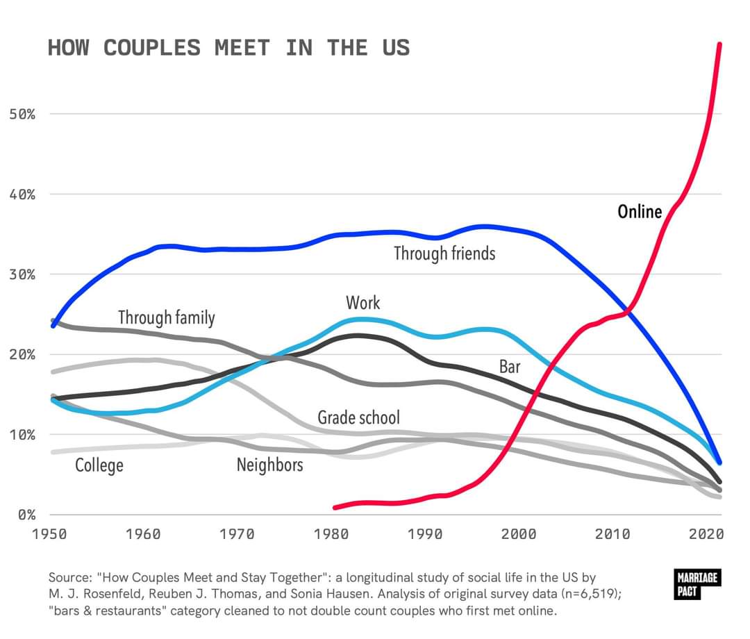
Yes, but that's a bigger denominator, and includes single people, and even those who have never been on a date. The headline question is what percent of couples met through different methods, not what percent of individuals, including those who are not currently in a couple.
It could be that a higher percent of couples met online than the percent of people who have ever used online dating. If you have a data set where online dating is literally the only way to meet people, but only half of the people are trying that method, you'd have the situation where 100% of couples met online but only 50% of people have ever tried online dating (this hypothetical is purely to demonstrate the math, not claiming that this is in any way a reflection or the actual data).
It's entirely possible (and I'd argue is likely) that the 53% who have used dating services are more likely to be in couples than the 47% who haven't. And so that larger subset of the 47% would therefore be excluded in the "percent of couples" data.
The 2019 paper I've linked is authored by the maintainers of the linked data set, and contains a very similar graph with an earlier cutoff (2017 data). I'm sure those authors know their data set. It's just most of their papers using this data is paywalled, and the data is mainly used for other types of analyses.
If I have time I might be able to download the data set from a computer and just map it either naively or by applying the correct weights.
The graph in that linked paper is convincing to me. I wonder about the discrepancy in the line for Met in Bar or Restaurant though, the 2010 upward trend in that is totally absent in the OP image.
The caption for OP's image says that stat was "cleaned up" to adjust for people meeting online. That could mean that some survey respondents met online and decided to meet in person in a bar or restaurant, and answered yes to both questions, and that those couples should be counted as "online" only.
Or it could mean they were actively swiping while at a bar or restaurant and looked up to see matches they've been recommended.