this post was submitted on 21 Aug 2023
29 points (75.4% liked)
Sync for Lemmy
15876 readers
1 users here now
👀
Welcome to Sync for Lemmy!

Welcome to the official Sync for Lemmy community.
The rules for posting and commenting, besides the rules defined here for lemmy.world, are as follows:
Community Rules
1- No advertising or spam.
All types of advertising and spam are restricted in this community.
Community Credits
Artwork and community banner by: @MargotRobbie@lemmy.world
founded 2 years ago
MODERATORS
you are viewing a single comment's thread
view the rest of the comments
view the rest of the comments

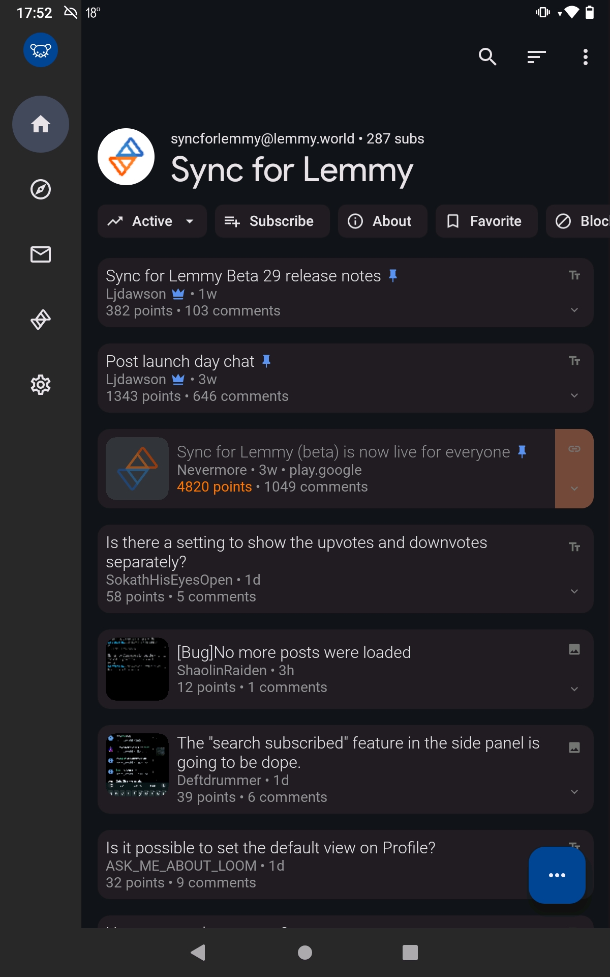
IIRC that space is a standard design attribute of Android's "Material You"
Previously on Sync, that space was used for subreddit banners, but I'm not sure if many Lemmy communities use a banner.
Designers, smh. Gimme a tiling Lemmy manager with maximum efficiency via keyboard only bindings.
You carry a keyboard everywhere you take your phone?
I thought the sarcasm would be obvious but I guess not.
It's the internet. sarcasm can get lost easily and I'd wager, lemmy has a higher percentage of autistic people than the average population. I mean I didn't catch it as sarcasm.