this post was submitted on 22 Apr 2025
475 points (97.2% liked)
Fuck AI
3688 readers
1243 users here now
"We did it, Patrick! We made a technological breakthrough!"
A place for all those who loathe AI to discuss things, post articles, and ridicule the AI hype. Proud supporter of working people. And proud booer of SXSW 2024.
founded 1 year ago
MODERATORS
you are viewing a single comment's thread
view the rest of the comments
view the rest of the comments

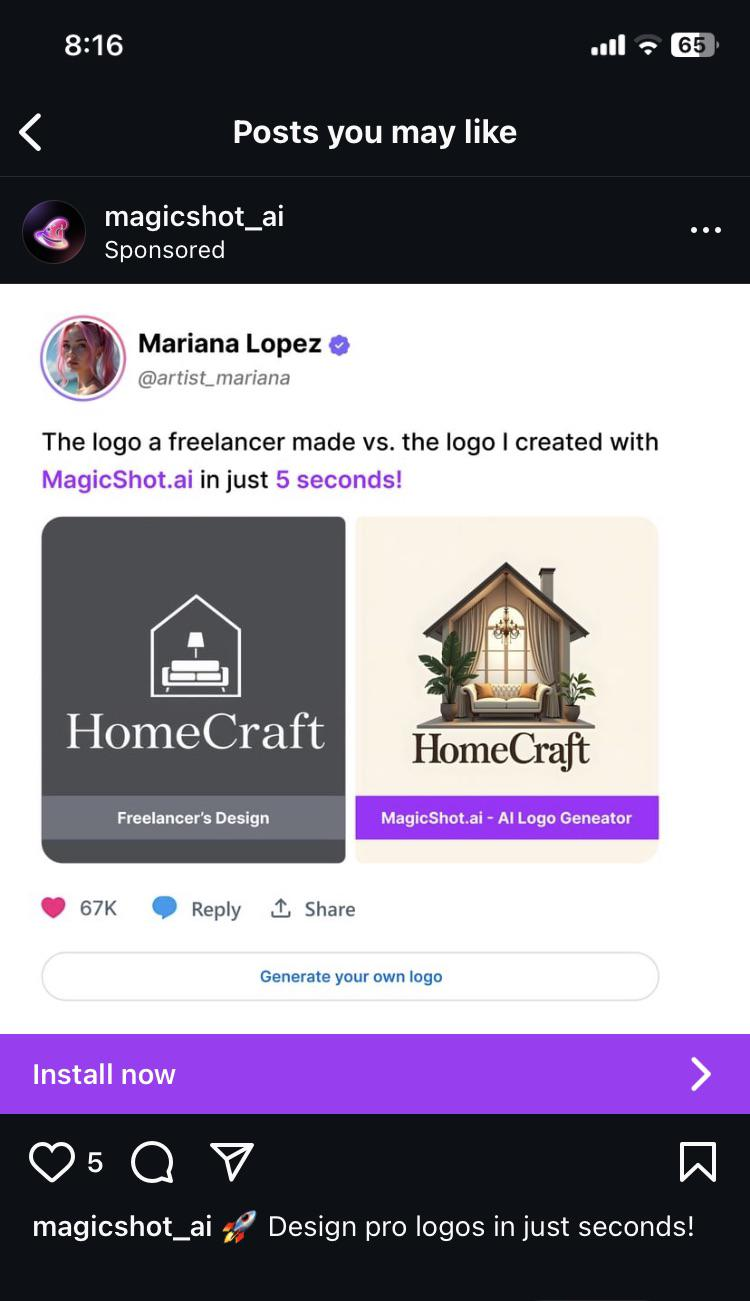
The one on the left is superior for a massive number of reasons.
Simple and easy to print, make copies of documents without becoming illegible, and other paperwork related reasons.
Easy to recognize at a glance. The one on the right is really hard to make out at a small size. Just a bland beige blob.
There is a reason most familiar logos are monochrome or only a few colors, and simplicity is one of them. The one on the right looks like overly bust clipart.
The one on the left is a couch inside a house with a lamp, all of which make sense together. The plants overlap the wall and there is a chandelier over the couch on the right one. Who puts a chandalier over a couch?
Ugh, I know it is obviously awful but I had to get it out.