this post was submitted on 22 Apr 2025
475 points (97.2% liked)
Fuck AI
3753 readers
505 users here now
"We did it, Patrick! We made a technological breakthrough!"
A place for all those who loathe AI to discuss things, post articles, and ridicule the AI hype. Proud supporter of working people. And proud booer of SXSW 2024.
founded 1 year ago
MODERATORS
you are viewing a single comment's thread
view the rest of the comments
view the rest of the comments

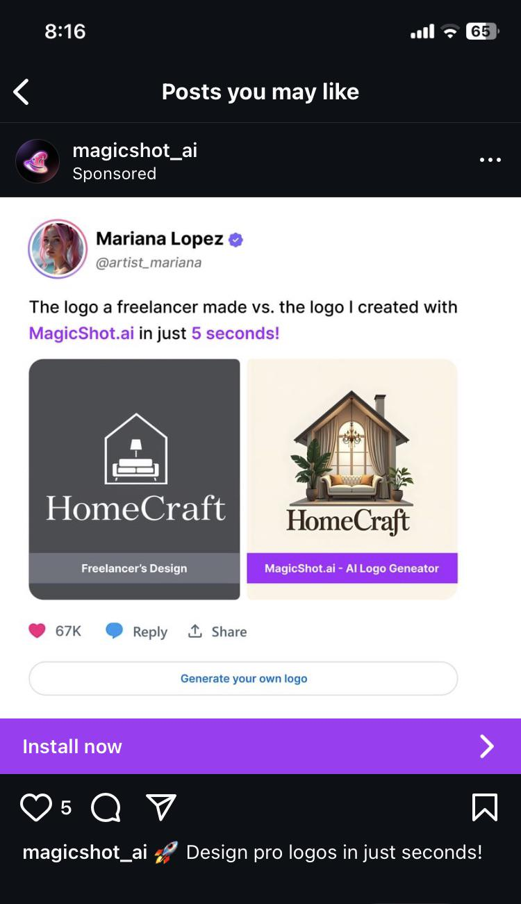
Personal taste is totally fine, but what you're describing isn't a logo, it's an illustration. A good logo specifically must be simple so that it can be applied across a bunch of different contexts — print, digital, large, small. What if you wanted your logomark as a favicon? Depth and lighting would make it look like a smudge at that size. What about stitching your logo onto a hat?
This is the main issue. Logos are part of a brand system, and generating a logo with AI circumvents all that thought. You get something that might look good, but your whole system becomes super fragile.
Again, there's no disagreeing with personal taste, it's just a matter of thoughtful use of the system and medium.
(Not the original guy that replied to you) I do agree about the blandness of many logos (god I hate flat design) and think the logo on the left is very bland, but the one on the right just does not work in many contexts. There's a middle ground where it works just fine, but with as much detail as in the AI gen logo it will look awful at small sizes. One is usable as a general purpose logo, the other isn't.
I totally agree that more diversity in art makes things more interesting, and I'm a big fan of bucking trends to make things unique. Art should be able to exist on its own merit, as the artist intended, divorced from what would make a better t-shirt. Even stepping out of art and into design, it makes me sad how many cars are grey, black, or white. Let's get some variation!
But... This is a logo. It's not a poster. It's not a t-shirt or a building or a painting. It's a logo. As such, there are some specific criteria that will make it better at being a logo. It needs to be instantly recognizable. It needs to be legible across a wide variety of contexts, sizes, mediums, and color applications. As a result, logos tend to be better if they're simpler.
The AI output is an illustration because it uses things like shading, complex shapes, and shadows, etc... Can you use an illustration for a logo? By all means. In some situations, it'll probably look nice. But at a certain size, it just won't be recognizable, and then it won't be doing the main job you want a logo to do — be instantly recognizable across as wide a set of scenarios as possible.
Also, to be clear, I'm not a fan of the logo on the left either. It's not particularly imaginative, the highly variable line weight makes it feel in cohesive, and the details mean it probably wouldn't work well at small sizes either.