1192
you are viewing a single comment's thread
view the rest of the comments
view the rest of the comments
this post was submitted on 29 Aug 2023
1192 points (98.4% liked)
RetroGaming
19566 readers
526 users here now
Vintage gaming community.
Rules:
- Be kind.
- No spam or soliciting for money.
- No racism or other bigotry allowed.
- Obviously nothing illegal.
If you see these please report them.
founded 1 year ago
MODERATORS

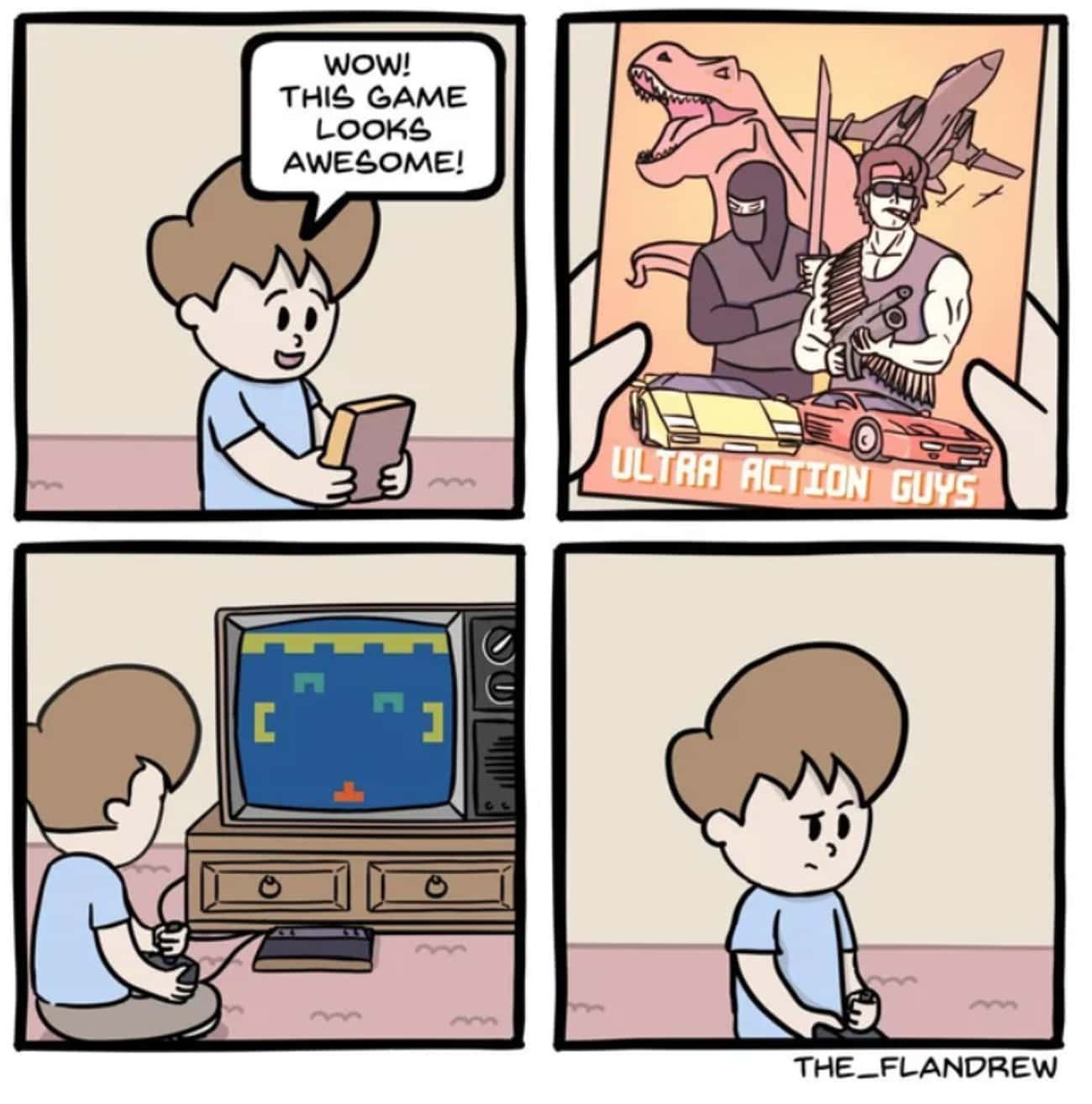
Always?
Have you seen the cover art for the first MegaMan game? lmao
Even funnier with the boasting of "state of the art high resolution graphics" at the top. Though to be fair, the actual game looks infinitely better than that cover.
Looking at this cover art again now, it kinda reminds me of AI-generated art lol
I love bashing AI art but in AI art it's usually the details that you spot at second glance that makes it fall apart. The Mega Man cover is just fundamentally messed up to a degree where even AI art is miles ahead.
Yeah true, AI art is more "looks OK at first glance, but smaller details are messed up", while this one is the opposite of that so "smaller details are actually fine, but as a whole it looks quite messed up" haha