If you're familiar with modern Heathcliff, then you've no doubt seen plenty of Gallagher's funny window art, in which the windows barely make any sense structurally, with the characters behind them frequently look like little more than cardboard cutouts.
These things aren't really *super-duper* unusual for comic art, but with the way Gallagher's been pushing the strip in reductionist ways the last few years, it all tends to get slightly more silly with each passing year. Imagine my surprise then when I was reading some old French-language "Balthazar" comics, and I noticed that de Moor seemed to have anticipated all this in the mid-60's!
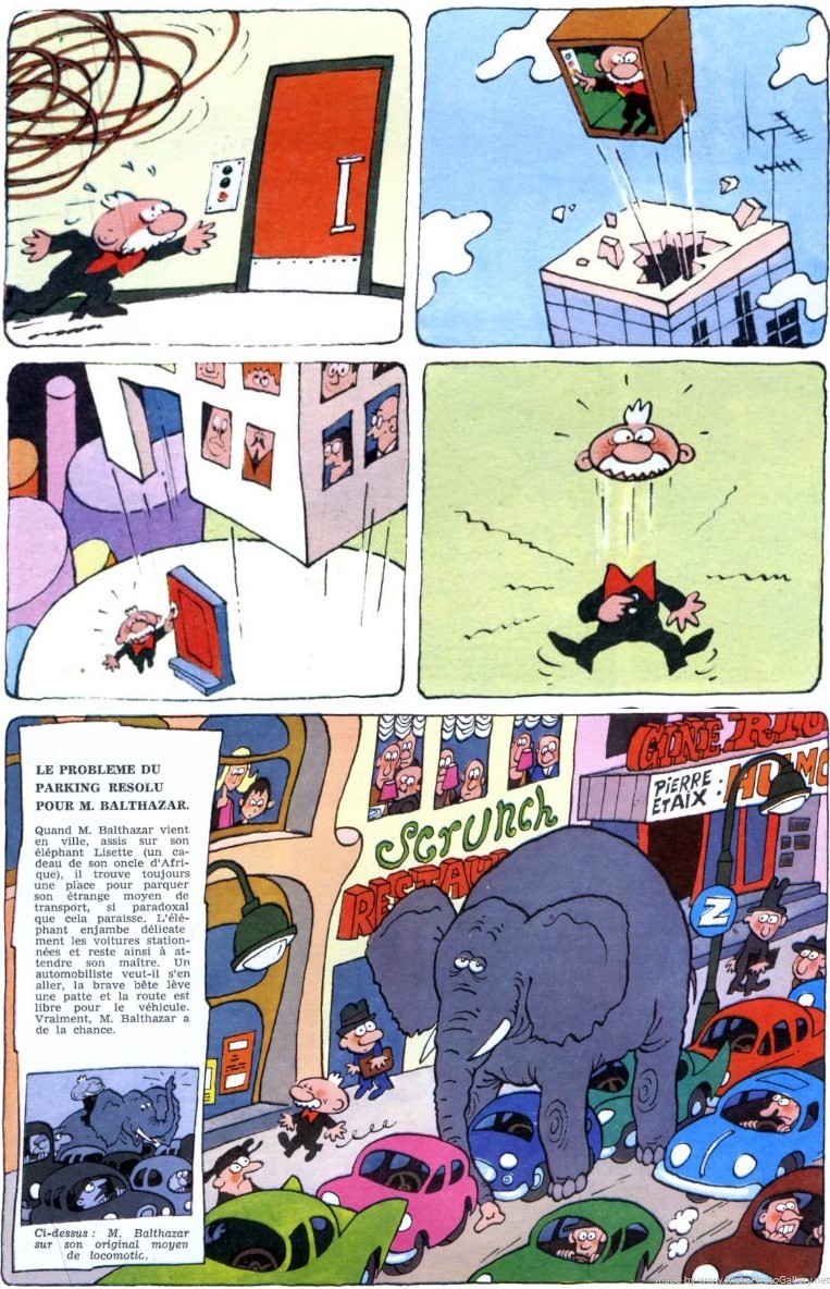
What I've done above is to cut out panels from two different comics pages and stitch them together. I doubt any explanation is necessary when you look at the two buildings. And for those who want to see what the full pages looked like:

(right-click as needed)

Looks like they're all online (all ~35), but I wouldn't have a clue which issue to look at.
It's probably the within the first three pages of #1 or Darker Image. I remember it being extremely early and setting a tone for the art.
I'd pull it out but I'd have to go through a few boxes to find it.
I don't know, maybe this?
Not a full front view of the building. I'll have to pull some out and find it.