this post was submitted on 04 Sep 2023
952 points (96.8% liked)
Memes
51905 readers
551 users here now
Rules:
- Be civil and nice.
- Try not to excessively repost, as a rule of thumb, wait at least 2 months to do it if you have to.
founded 6 years ago
MODERATORS
you are viewing a single comment's thread
view the rest of the comments
view the rest of the comments

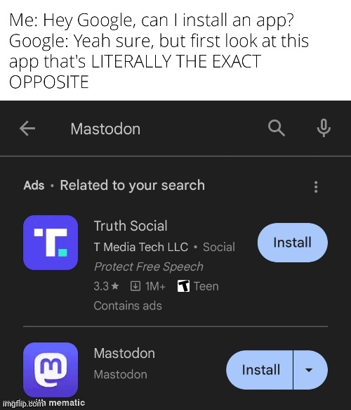
I dunno, it says right there "ads related to your search"
It was designed to blend in with the search results. It's the same shitty design as the sponsored results appearing like they were the first few results of your Google or Bing search, or ads appearing as unread emails in Gmail or Hotmail.
Yeah, I get it, I am just saying that companies have been doing that for a long time now, and we gotta just be computer literate enough to discern the difference. It's shitty, I agree
Dark Pattern
All of those things literally say "ad" next to them. Do people not see that?