this post was submitted on 13 Jan 2024
481 points (92.0% liked)
memes
17538 readers
2268 users here now
Community rules
1. Be civil
No trolling, bigotry or other insulting / annoying behaviour
2. No politics
This is non-politics community. For political memes please go to !politicalmemes@lemmy.world
3. No recent reposts
Check for reposts when posting a meme, you can only repost after 1 month
4. No bots
No bots without the express approval of the mods or the admins
5. No Spam/Ads/AI Slop
No advertisements or spam. This is an instance rule and the only way to live. We also consider AI slop to be spam in this community and is subject to removal.
A collection of some classic Lemmy memes for your enjoyment
Sister communities
- !tenforward@lemmy.world : Star Trek memes, chat and shitposts
- !lemmyshitpost@lemmy.world : Lemmy Shitposts, anything and everything goes.
- !linuxmemes@lemmy.world : Linux themed memes
- !comicstrips@lemmy.world : for those who love comic stories.
founded 2 years ago
MODERATORS
you are viewing a single comment's thread
view the rest of the comments
view the rest of the comments

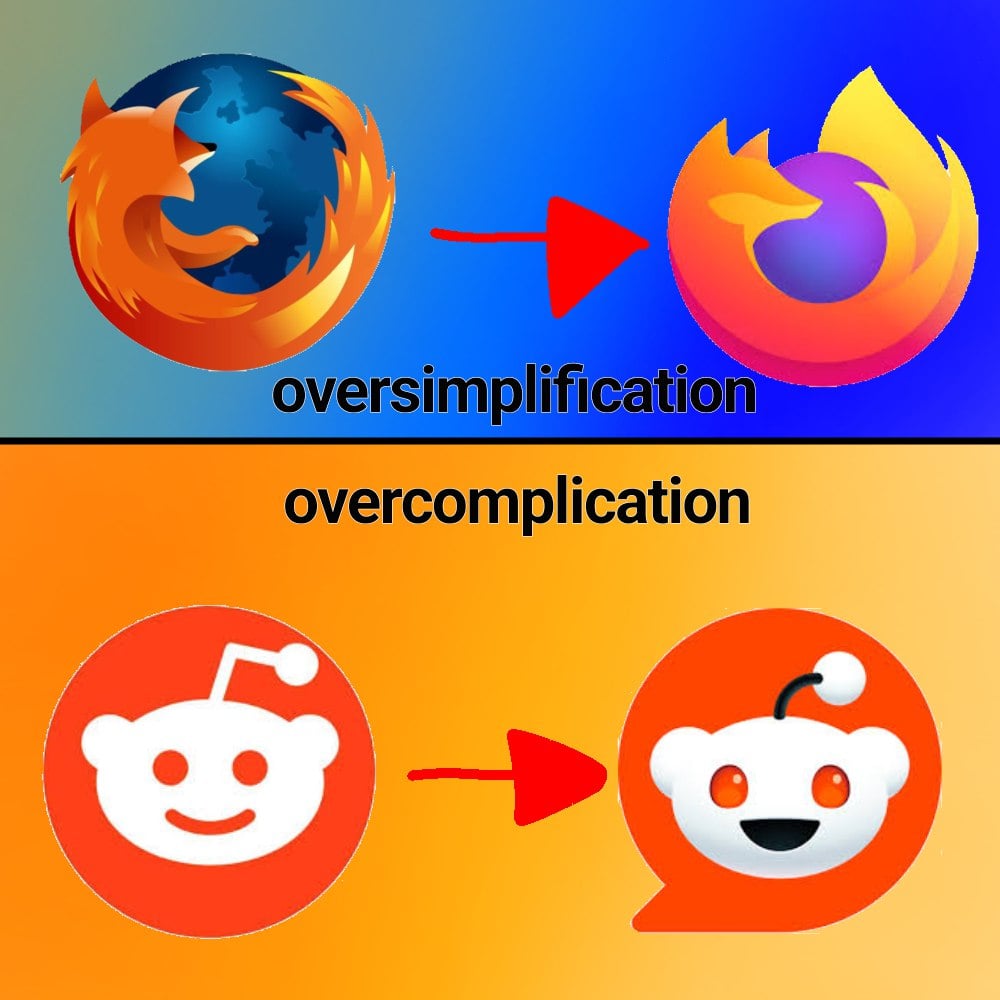
Never forget what they took from us
I still think the 2017 logo was their best, like a nice middle ground between this version and the current one:
I like this one. New ones missing the paw and has an odd tail end to me.
Agreed. This is the best one. And yes the new tail is awkward, I was thinking the same thing.
Those bastards cut off his arm!
This gives me the warm fuzzies
I liked this so much more! It was cute and charming.
The new logo looks so office neutral/corporate friendly.