this post was submitted on 27 Jan 2024
512 points (85.2% liked)
Data Is Beautiful
8876 readers
1 users here now
A place to share and discuss data visualizations. #dataviz
founded 4 years ago
MODERATORS
you are viewing a single comment's thread
view the rest of the comments
view the rest of the comments

Do you know a community that fits?
Nah, here is fine, the data is presented beautifully.
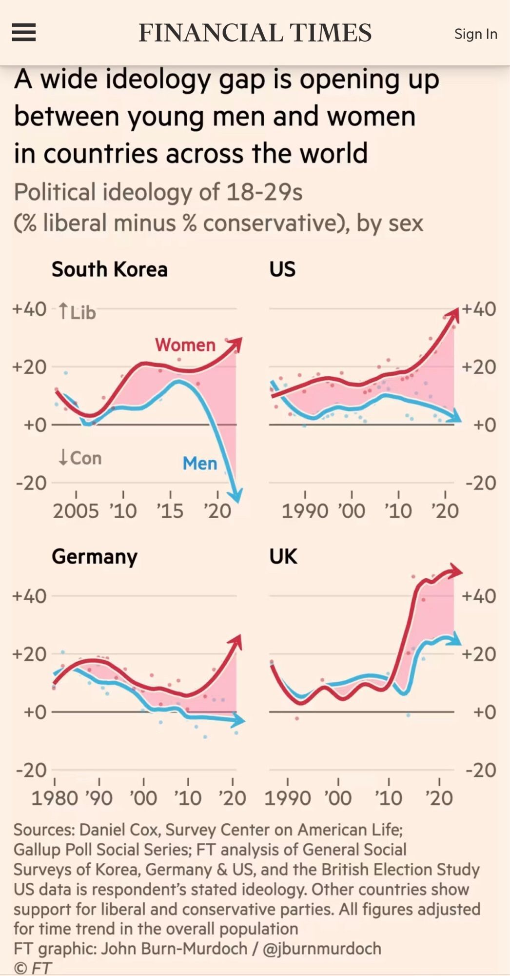
Except the time frame is shifted for each graph
+1 this. This community isn't about agreeing with the data, it's about how it's presented
No no, that's not what I meant. I wasn't trying to have a go at you. It fits here perfectly. I was just upset at the trend it was showing :\
The data is beautiful, it's the implications that are ugly