this post was submitted on 07 Feb 2024
150 points (99.3% liked)
196
18178 readers
167 users here now
Be sure to follow the rule before you head out.
Rule: You must post before you leave.
Other rules
Behavior rules:
- No bigotry (transphobia, racism, etc…)
- No genocide denial
- No support for authoritarian behaviour (incl. Tankies)
- No namecalling
- Accounts from lemmygrad.ml, threads.net, or hexbear.net are held to higher standards
- Other things seen as cleary bad
Posting rules:
- No AI generated content (DALL-E etc…)
- No advertisements
- No gore / violence
- Mutual aid posts are not allowed
NSFW: NSFW content is permitted but it must be tagged and have content warnings. Anything that doesn't adhere to this will be removed. Content warnings should be added like: [penis], [explicit description of sex]. Non-sexualized breasts of any gender are not considered inappropriate and therefore do not need to be blurred/tagged.
If you have any questions, feel free to contact us on our matrix channel or email.
Other 196's:
founded 2 years ago
MODERATORS
you are viewing a single comment's thread
view the rest of the comments
view the rest of the comments

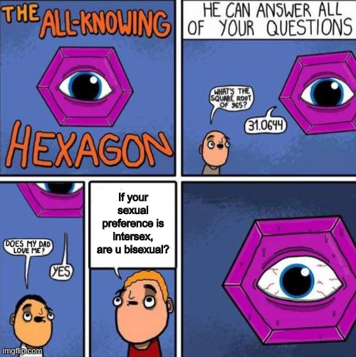
They appear to be moved around because the original creator [didn't] put the text boxes in intuitive places. It's instinct to read from top to bottom if both text bubbles are centered at the same spot.
EDIT: missed an important word
Outside of the crop, the edit is a big improvement to readability for me. Trying to read the original was really confusing for a second.
Yeah, that's what I meant. I accidentally wrote the opposite. Added the word.
The hexagon already knew the question so it answered before the question was even asked. It all makes sense.
That all makes sense, although I still find it odd that someone put that much effort into making someone else's comic more readable.