this post was submitted on 02 Apr 2024
1332 points (96.9% liked)
Memes
52763 readers
932 users here now
Rules:
- Be civil and nice.
- Try not to excessively repost, as a rule of thumb, wait at least 2 months to do it if you have to.
founded 6 years ago
MODERATORS
you are viewing a single comment's thread
view the rest of the comments
view the rest of the comments

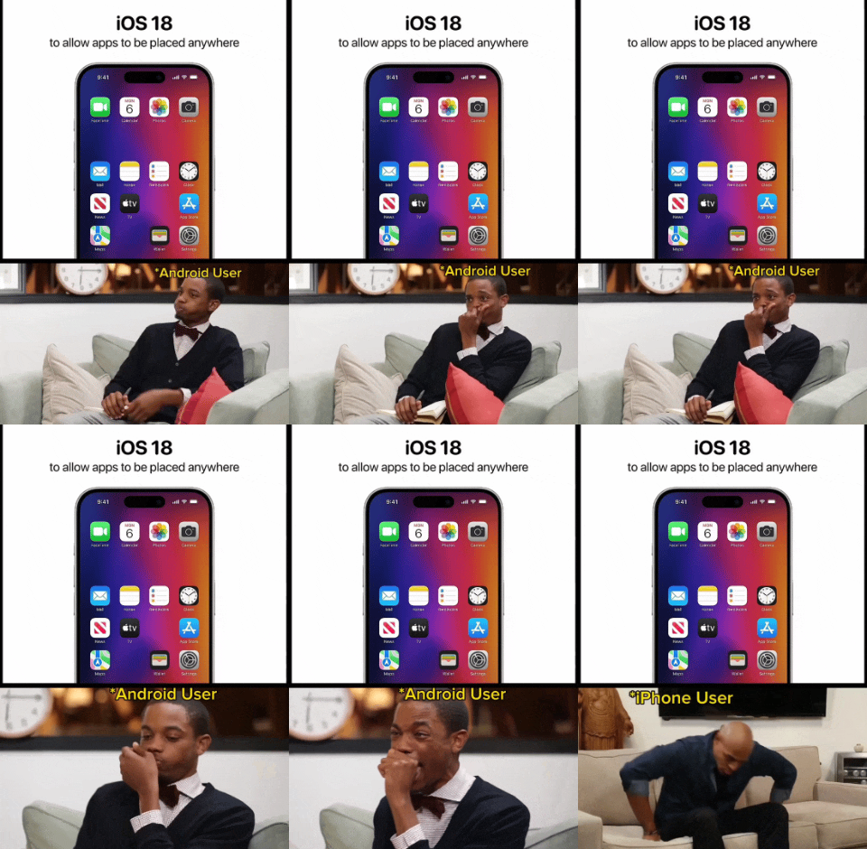
Before the app library existed you just had to have all the apps on a page and could not hide them. I ended up having like 20 page of apps. I eventually cleaned things up and have a page with apps I use, another page of widgets I use, and that's it. But it took me years before I thought to do that.
Oh I know, it was madness. I briefly had a used iPhone 3GS and then was pure Android until 2022 when I got an iPhone. By the time I came back it was customizable enough that I could make it look like Android, but that’s work for someone who lived with the terrible setup it originally had. I don’t blame existing iPhone users, it’s just something I’ve noticed.
It’s funny, I’ve had an Android, a Nokia Windows Phone, and an iPhone, and Windows Phone was the only OS in which I didn’t open every single app through search. The utter lack of an app ecosystem definitely played a part, but I honestly don’t think either of the other two handle home screens/“app drawers” very well. Every modern social media platform/messenger/etc. is built around vertical continuous scrolling because it’s easier. Why is horizontal, paginated scrolling the default for home screens?
That's a good point. Now that you mention it, I would much rather my Home Screen scroll down and I can add as many apps and widgets as I want.
The current iPhone page feels a bit claustrophobic now. Thanks.