this post was submitted on 25 Apr 2024
74 points (88.5% liked)
Solarpunk
7511 readers
45 users here now
The space to discuss Solarpunk itself and Solarpunk related stuff that doesn't fit elsewhere.
Join our chat: Movim or XMPP client.
founded 3 years ago
MODERATORS
you are viewing a single comment's thread
view the rest of the comments
view the rest of the comments


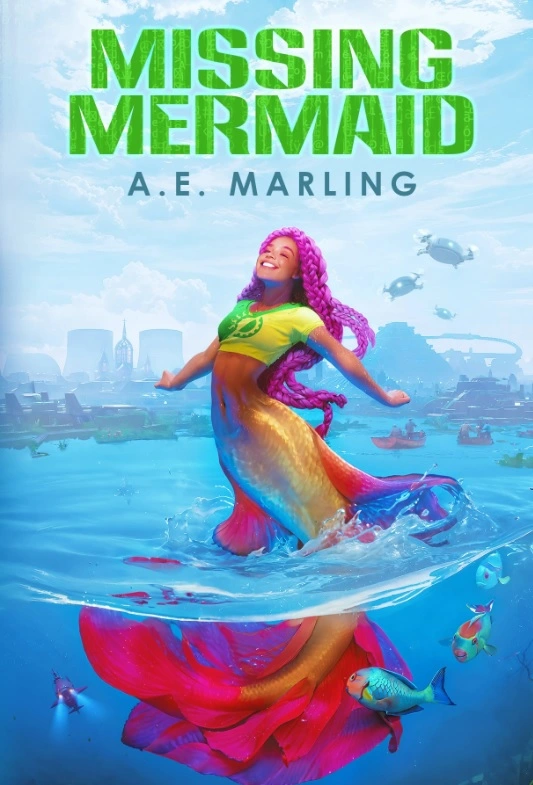
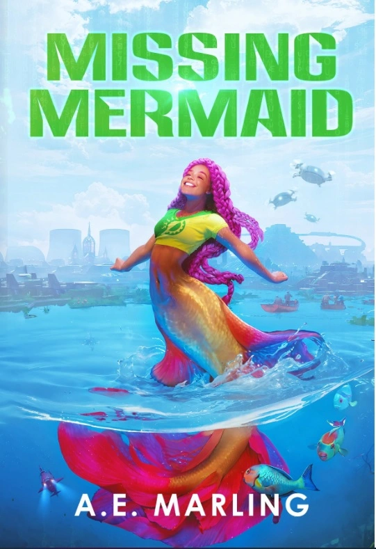
I like option 2, I thought I would prefer Option 1 before I saw 2 but it’s executed really well in 2! Also, that illustration is gorgeous, and thank you for sharing the illustrator’s details. I want my next novel to be solarpunk, and I am definitely in the market for a new cover artist…
I need to add this and Murder in the Tool Library to my storygraph. And preorder/buy a copy of both tbh.
I wish you the best with your own solarpunk writing. Be careful when hiring an illustrator. I've had some issues avoiding AI art.
Hope you enjoy Murder in the Tool Library. Wishing you greener futures.