this post was submitted on 03 Aug 2023
1418 points (85.5% liked)
Memes
51869 readers
950 users here now
Rules:
- Be civil and nice.
- Try not to excessively repost, as a rule of thumb, wait at least 2 months to do it if you have to.
founded 6 years ago
MODERATORS
you are viewing a single comment's thread
view the rest of the comments
view the rest of the comments

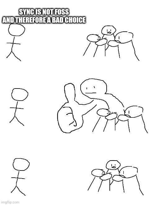
Interface, usability and features fit for my needs, that's all the benefits I need.
Features I like for my clients are
Sure there are a few that satisfy some or all of these, but you have to take into account personal taste as well. No one will buy a banana with perfect nutritional values, when it tastes like tobacco.
There isn't a one-fits-all solution, just try them out and stick with what fits you best.
For now I completed the client speedrun and chose Sync, but I'll give Boost a try when it releases, since I used them before, but as soon as Infinity hits the store, I'll probably return to that, Docile Alligator created the perfect mix of simplicity, usability and visibility for me.