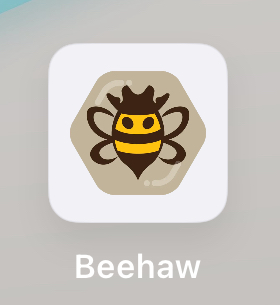
Shiny hatted bebby bee boi
Looks good to me!
Not sure why, but the previous one made me smile. When I think about it, I believe there's two reasons why.
First, that the previous looked more like an actual insect. It clicked in my mind instantly as an insect and then I noticed all the cute details.
Second, I think the angle was different. After being stung from bees a lot, some of them on the face, this angle makes me feel that it's about to land on me. The previous angle (if I remember correctly) made me feel like I was an observer of the insect going about it's life, whether wasp or bee, no feeling of threat.
Not sure if I describe it properly, maybe just the usual old vs new and force of habit..
No I think you're on to something
I will keep my current PWA with the ol icon for now
Looks great!
I love it!
I do love that you have a go-to artist you support here who has been doing great work on our site icons, but this one is a bit disappointing for me.
This logo looks a lot more aggressive, like it's staring me down in anger and about to draw its pistols for a duel. There is no distinct head section, so the eyes look like predator-deterring fake eyes on its back. The eyes also look pointy and menacing in the tiny size it appears at the top of the page in my mobile browser. My brain interprets a sharp point reaching up from the apex of each eye to the hat due to the small gap between hat and eye. I see they are actually rounded off in the large version, but they don't look round in tiny form which I am chalking up to an optical illusion at the working size. I also don't like the lack of segmentation in the body.
The top of a cowboy hat is often a little bit narrower than where the crown meets the brim, the taper and dip make it easier to grasp the stiff top of it to take it off and put it on with one hand instead of having to grab it awkwardly by the wide brim. The really wide split at the top means that bee needs some giant hands to grab its hat. I also don't understand the purpose of the extra bulk on the rim.
The thin connection point of the wings and lack of any filler color makes it look like an atom symbol floating behind the bee instead of a part of its body.
The old logo did look more like a wasp and the face was a weirdly fleshy color, but mainly it just needed a rounder bottom to soften it up. The wings were clearly wings, the head was clearly a head, and the hat didn't sort of look like a crown.
I hope there will be more iteration on this logo and look forward to seeing what comes up next. Someone shared a version with a very mustache looking stripe on it and I loved that little detail.
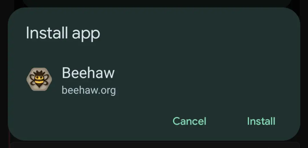
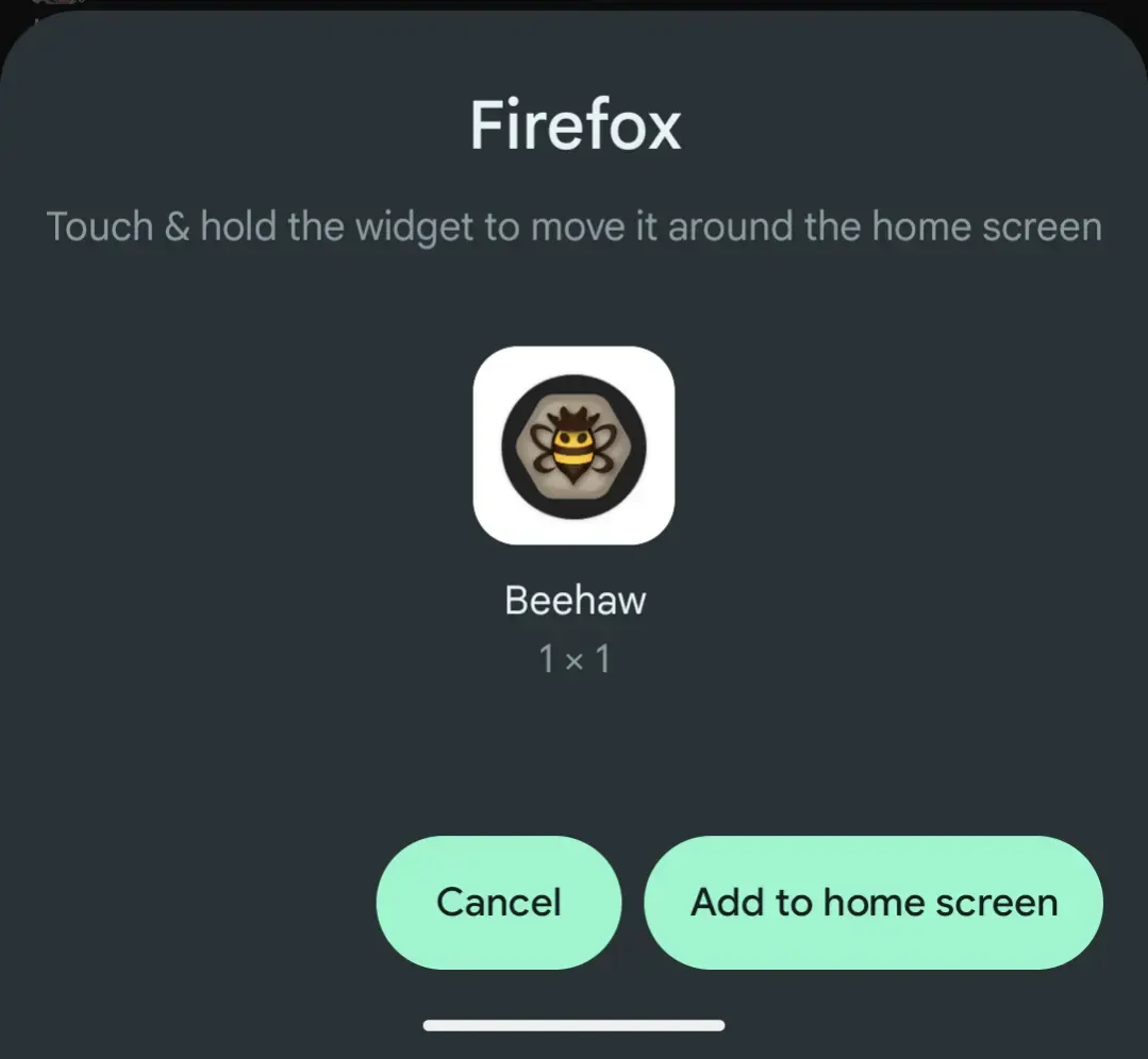
For some reason with the updated logo it seems the PWA's icon is now missing. 🤔 (Chrome Android)

What browser and operating system is that on? Apple, safari? Android, firefox? Something else?
This was on Android Chrome but it seems have been resolved. 🤷♂️

Also checked Android Firefox. All good there as well.

Thanks for that information, definitely should not be the case. I'll take a look again.
Personally, I'd take the background out and make the bee itself a bit larger.
Not bad though!
I like the new one a lot!
I can't really see it that well. Is there a bigger version that can be posted here?
Not great, but here is a bigger version.

Thanks!
Beehaw Support
Support and meta community for Beehaw. Ask your questions about the community, technical issues, and other such things here.
A brief FAQ for lurkers and new users can be found here.
Our September 2024 financial update is here.
For a refresher on our philosophy, see also What is Beehaw?, The spirit of the rules, and Beehaw is a Community
This community's icon was made by Aaron Schneider, under the CC-BY-NC-SA 4.0 license.