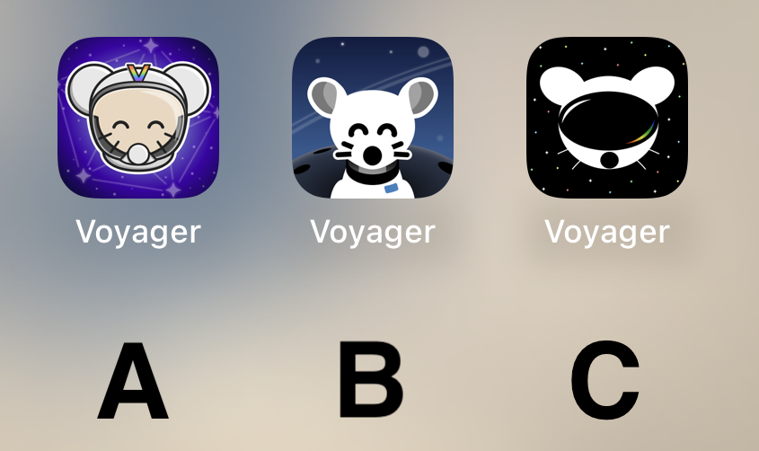
B, good middle ground of clean design yet still has personality
Voyager
The official lemmy community for Voyager, an open source, mobile-first client for lemmy.
Rules
- Be nice.
- lemmy.world instance policy
Sponsor development! 👇
💙
I like B the best.
🅱️
I’m just here to say: CHARGE YOUR PHONE!
Also, C A B is my ordered preference.
I prefer what we already have but if we have to change then go with A
Why I chose "B": It's clean and professional-looking. "A" looks a bit complex in comparison, and "C" doesn't look much like a lemming.
C
I really like A, feels very professional
C
C Simple and cool but gets the point across.
Definitely A.
B is kinda creepy and C looks like a VR app.
C
I really like B!
I vote B.
It’s really cool to have such talent in this community to go along with such an amazing app. The 3 finalists are really good. I don’t usually use dark icons but I love C so much. I hope to see variations of it as the app grows. Congratulations to all who made it to the top 3! That in itself is an accomplishment. I can’t wait to see the results of the final! This community is awesome!
C
Voted for A, it’s definitely the cutest and I like the rainbow “V”. B has a nice background, though. C I think could do with better defining the shape of the head to look more like a helmet and less like a mouse wearing a VR headset :) Great job to all the applicants!
I'd go with A! I like the presentation of B better but the little guy reminds me of Chuck E. Cheese or fnaf. Character in A is adorable :)
I liked C too but it kinda looks like the Reddit guy in VR goggles.
C
I liked C best at first glance, but after looking at the screenshots my choice is A.
C is very sleek!
C
A
B but with the helmet and head of A would have been amazing. A looks to shiny rn.
B looks best for me
I like Option B the most
B
Can you add support for themed icons?
https://proandroiddev.com/implement-themed-icons-android-13-d20b89233681
All the other Lemmy apps I tested have themed icons. Be nice to have the same with the only Lemmy app I use 😁
C
I like C.
Can we have them all and a setting to choose? Other apps do that. Is it a limitation of the PWA?
I vote for A
A
A or C
Middle B. SOOOO cute! Good definition and simpler than the others. Good contrast between foreground and background. Great little icon!
B by far
obviously B
C for sure
I like the current one but I voted for A if you have to change it. It looked the best on the desktop.
I want them all! They all look fabulous!


