this post was submitted on 16 Sep 2024
273 points (95.7% liked)
RPGMemes
13824 readers
1010 users here now
Humor, jokes, memes about TTRPGs
founded 2 years ago
MODERATORS
you are viewing a single comment's thread
view the rest of the comments
view the rest of the comments

I am!
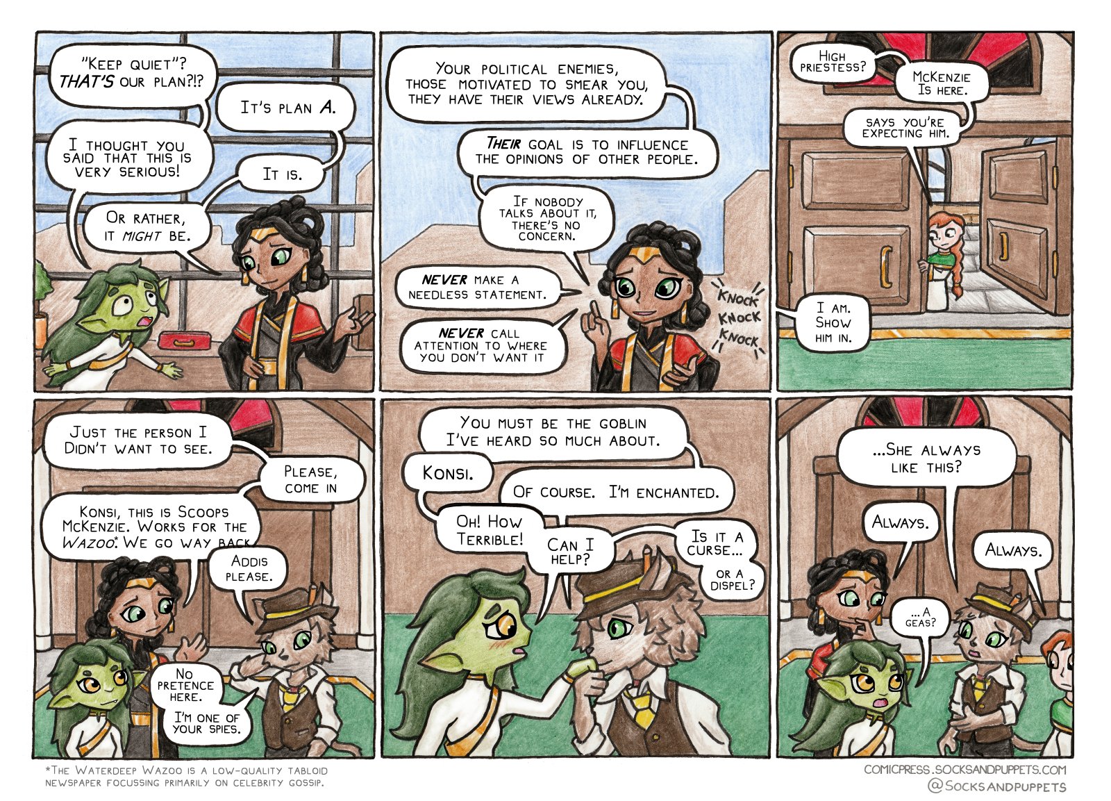
Yes. One of the benefits of this is that it makes my visual style rather unique - I often get asked what digital brushes I'm using to get these pencil textures, and the answer is "pencils." One of the downsides is it means it's quite slow to make new pictures.
I used to hand-letter, but lettering is a surprisingly slow and taxing job, and I found myself spending a lot of time touching it up digitally, so now I use a font I made from my own handwriting.
Here's an image showing many of the physical media brands and tools I use. Notes:
Here's a step-by-step showing how it looks as I go
And, here's a photo of the pencilwork for this specific comic :D
I didn't notice until now that your characters sometimes slightly cover the text boxes! Very cool.
Yeah. I also sometimes break the panel borders this way too, to avoid tangenting. Addis' fingers in the first panel actually break out of it very slightly here.
In Making Comics Scott McCloud talks about these techniques as "fourth wall breaks" - if your characters significantly overlap the framework scaffolding of the comic itself (speech bubbles, panel borders, gutters, other panels etc) it can serve to build up dramatic intensity, especially when combined with other techniques like oversized letters, or dramatic panel shapes, or intense forshortening.
Here, the purpose is much less grandiose... I have a limited size for the panel on the page, and speech bubbles take up a LOT of real estate (especially with this much dialogue.) This forces me to squish my art into the remaining space, but I can get a little more of it out if I disrespect the panel apparatus.