this post was submitted on 10 Nov 2024
671 points (98.6% liked)
Programmer Humor
37423 readers
8 users here now
Post funny things about programming here! (Or just rant about your favourite programming language.)
Rules:
- Posts must be relevant to programming, programmers, or computer science.
- No NSFW content.
- Jokes must be in good taste. No hate speech, bigotry, etc.
founded 6 years ago
MODERATORS
you are viewing a single comment's thread
view the rest of the comments
view the rest of the comments

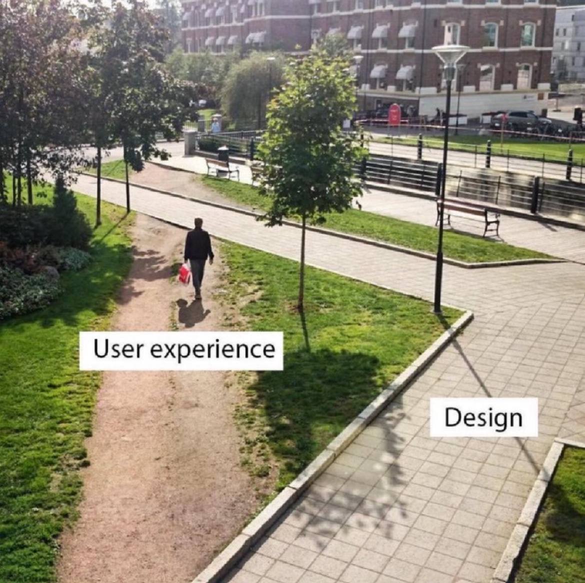
Pretty sure the user experience folk are screaming for a path to be built there but are getting ignored.
They aren't being ignored. The corner needs to be a right angle for compliance reasons.
But the actual corner isn't even a right angled corner.
They were forced to cut corners in implementation.
Everyone says, they are not bringing their best angles. Triangles. Quadrangles. And some I assume are acute angles.
All I want is an angle who's acute and not right.
What we should do is put chainlink fence around the corner, but make the part that the users loved the most accessible with a monthly pass that they can only walk on with shoes purchased at the university store.
- spez
You mod 16 subs, what do you get?
Another day blocking API requests.
Saint Peter don’t DM me cuz I can’t go.
I owe my soul to Spez’s asshole.
It's important we do it that way for our 🌟brand identity🌟.
Management wants us to add more AI and Machine Learning so the user ends up in the parking lot.
How about a pond?