this post was submitted on 10 Jan 2025
113 points (95.2% liked)
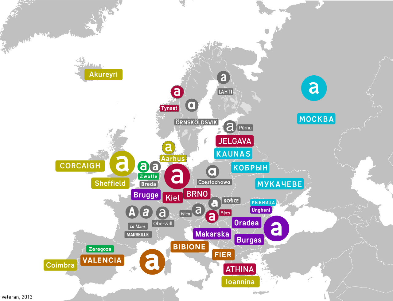
Map Enthusiasts
4806 readers
79 users here now
For the map enthused!
Rules:
-
post relevant content: interesting, informative, and/or pretty maps
-
be nice
founded 2 years ago
MODERATORS
you are viewing a single comment's thread
view the rest of the comments
view the rest of the comments
Also I don't really like Grotesk as a transport typeface, it's too bold+curvy...
The kerning on the "Od" there feels too loose to me.
I think it would be alright in uppercase. The problem is that lowercase height is barely above half of uppercase, as opposed to most display fonts.