this post was submitted on 22 Apr 2025
475 points (97.2% liked)
Fuck AI
3753 readers
732 users here now
"We did it, Patrick! We made a technological breakthrough!"
A place for all those who loathe AI to discuss things, post articles, and ridicule the AI hype. Proud supporter of working people. And proud booer of SXSW 2024.
founded 1 year ago
MODERATORS
you are viewing a single comment's thread
view the rest of the comments
view the rest of the comments

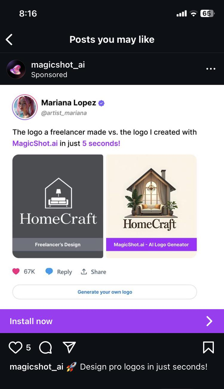
That's really only suitable if the logo is going be displayed at a larger size on a screen. Many times logos will be displayed much smaller, such as when used as a favicon. When you cram too many details into a small space it just becomes noise. This also applies if people glance at the logo, since too much detail will make it difficult to work out what it is.
Also as other people have mentioned. If you are going to be printing your logo, then you do need to have a design that uses just negative and positive space since it's easier to print and will look much cleaner.
Additionally it's pretty common for organizations to have multiple versions of the logo as well. Usually a black and white one, a colored version of it, and versions with and without text. They could also have a more detailed version of the logo as well, but the other versions are more useful, so they may not even bother.