this post was submitted on 18 Jul 2023
636 points (96.0% liked)
Voyager
7167 readers
3 users here now
The official lemmy community for Voyager, an open source, mobile-first client for lemmy.
Rules
- Be nice.
- lemmy.world instance policy
Sponsor development! 👇
💙
founded 2 years ago
MODERATORS
you are viewing a single comment's thread
view the rest of the comments
view the rest of the comments


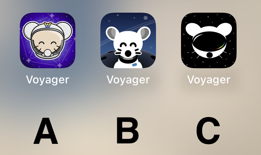
I also think the contest guidelines are partly to blame. The whole, "avoid the corporate vector look, look at these super detailed illustrations" thing is horrendous advice. It basically translates to, "avoid doing what the most talented app icon designers in the world do."
Yes, the icon should be fun and stand out. Yes, the Facebook "f" is boring as fuck. But some of the greatest app icons are extremely simple, and there are reasons for that. Fine details don't display well in the actual contexts that icons are used in; they make the design seem muddy and confused. People resonate with clear design that knows its purpose.
IMO you just hit the nail on its head: it's an icon not a miniature fanart, it can be simple, yet creative, original and most important, easily recognizable, less is more. These options look like Apollo knockoffs.