636
submitted 1 year ago* (last edited 1 year ago) by aeharding@lemmy.world to c/voyagerapp@lemmy.world

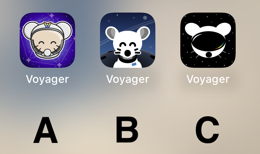
Voting has ended! Congrats to @fer0n@lemm.ee with option B. Thanks everyone for participating! :)


First off, thanks to everyone that participated in our icon contest last week!

I'm excited to show the final three options for you to vote on below!

Overview

Option A

Option B

Option C

๐Ÿ—ณ๏ธ Vote!

โš ๏ธ BEFORE VOTING I encourage you to tap through the links above to see what it's like on your homescreen!

Results of the poll will not be available until it has ended, so no need to make a rushed decision.

~~VOTE HERE: https://strawpoll.com/BDyNEbKeqZR~~

Strawpoll privacy

~~Polling ends in ~24 hours! If there is a tie, I will cast the final vote.~~

you are viewing a single comment's thread
view the rest of the comments
[-] Vub@lemmy.world 15 points 1 year ago

No offence to the creators of A and C but they both completely lack the right spacing, centering, decent line widths etc to suit an app icon. They both look broken.

So โ€ฆ B. By far.

But I almost like the current icon more because it is so colourful, it just needs a modified lemming.

this post was submitted on 18 Jul 2023
636 points (96.0% liked)

Voyager

5600 readers
469 users here now

The official lemmy community for Voyager, an open source, mobile-first client for lemmy.

Download on App Store

Download on Play Store

Use as a Web App

Download on F-Droid

Rules

  1. Be nice.
  2. lemmy.world instance policy

Sponsor development! ๐Ÿ‘‡

Number of sponsors badge

๐Ÿ’™

founded 1 year ago
MODERATORS