
How do you give your life to Christ in a parking lot?
this post was submitted on 22 Aug 2025
316 points (96.2% liked)
People Twitter
7993 readers
643 users here now
People tweeting stuff. We allow tweets from anyone.
RULES:
- Mark NSFW content.
- No doxxing people.
- Must be a pic of the tweet or similar. No direct links to the tweet.
- No bullying or international politcs
- Be excellent to each other.
- Provide an archived link to the tweet (or similar) being shown if it's a major figure or a politician.
founded 2 years ago
MODERATORS
Is it supposed to read like he got banged in the ass for some crackers or am I just fucked in the head?
What a pathetic fucking culture.
Super pathetic.
What exactly are they pissed about? Yeah, the new design looks like ass, but what's woke or even political about that?
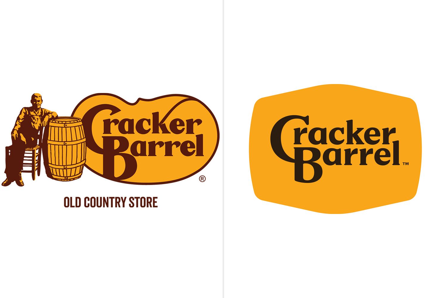
It's the original logo
The CEO is a woman! WITH GLASSES!!!
It's a day ending in Y, and they needed their daily outrage, so they can get their Dopamine fix.
Woke is anything you don’t like.
"Anything that I don't like is woke" word has lost meaning.
What, like he got crucified in their parking lot?
I hope so
This is such a stupid "controversy." I highly doubt that a company that has built itself on being old style southern has gone "woke," they just adjusted their logo - like EVERY OTHER corporation in America.
Look at the big Pylon outside of your local shopping center, the one with all the store logos listed on it. Nearly all of them are basically the same - their name inside of a rectangle. The only differences are the variables like the font, the font color, the background color, borders, drop shadows, etc. And that's it, just the company name in some font, in some color, on a background color. Things like hand-written fonts (Coca-Cola, Ford), odd shapes (Chevrolet), mascots (the Cracker Barrel Geezer), etc., are all out these days.
In fact, Cracker Barrel's new logo goes a little outside the norm with the odd shape.
This is just a corporation doing what corporations do. Why is this any of MAGA's business?
No woke? Back to picking cotton then. But just for this guy!
So now American corporations have to get permission from MAGA to change their logo?
I'm about to expand my business from a tourist city to a big HCOL city, and I want to rebrand it in the new city, with a new name and logo. Do I need to apply for MAGA permission first? Does Don Jr have to sign off first?
now that I've been forced to hear about this shit halfway around the globe, can someone tell me what's the significance of the bean-like shape of the original's background?
it echoes the shape of a baby in the womb or some shit, probably (retroactively decided by the general public)
seems like it has been referred to as kidney bean so that's what I'm gonna go with, not that it matters much anymore. at least until they inevitably bring it back
I mean does anyone else remember the story about Cracker Barrel refusing to seat black families, or is that just me?
I mean aside from it basically being in the name and having never seen a non pink person there... ever, there's these
https://aaregistry.org/story/restaurant-chain-admits-racism/
But like I said it's in the name dude. If you don't look like a cracker they'll put you over a barrel.
load more comments
(5 replies)
I'm not an American and I've only seen this logo a couple of time but I'll be completely honest - this remodel fucking sucks.
I despise minimalism and these transitions from oldschool cool to these post-modernist corporate garbage. And that's definitely one.
What is “woke” about this branding exactly? Are square minimalist logos more empathetic to minorities somehow? They seriously just use woke to describe anything they don’t like. Woke is to conservatives as bogus was to 90s surfer dude stereotypes.
They are getting rid of the old school Americana vibe they had.
I don't get it because it's "old school Americana"^tm^. It's a fucking national company. If you really care about old school americana you would be visiting local diners that have been established for decades, not some incorporated theme park of a restaurant. I can't take anyone serious that's upset about this.
There's nothing good about the new logo... but there is so much wrong with the old logo. This is a vast improvement, but it sure as fuck isn't going to get me into a Cracker Barrel.
I feel very opposite and really appreciate the minimalist in this case. I don't always, but I just don't think the old logo was aesthetically pleasing at all.
"Utter woke nonsense" - Some boomer
load more comments
(12 replies)
The real positive to take away from this is Cracker Barrel is dogshit food, and there's so many other equivalent dogshit chain restaurants usually located in the dogshit vicinity of a Cracker Barrel, that you can still eat dogshit, and not have to go inside a new, modern, dogshit Cracker Barrel.
... Just go to Applebee's or Chili's. It's the same dogshit.
Can we also offer another option called “respecting yourself” and ordering a pizza instead?
whoa whoa whoa stop right there chilis today is freaking awesome
As a European, I don't know what Cracker Barrel is, and I couldn't care less.
Go with that.
Most Americans don't care either honestly.
NO American cares about this, even the ones who are whining about it. They don't give a rat's ass, it's just an opportunity to be performative about...something.
sorry sir, but on an american thread, your sposed to say 'could care less"
load more comments
(9 replies)
Another chapter in "Everything i do not like is woke"
The new design is minimalistic slop, for sure. But why would i give a fuck about a companies logo. Honestly we should not even be reacting to this bait.
view more: next ›