That is common in east Asia in general, and I don't see why not 🤷
This is for strictly mildly interesting material. If it's too interesting, it doesn't belong. If it's not interesting, it doesn't belong.
This is obviously an objective criteria, so the mods are always right. Or maybe mildly right? Ahh.. what do we know?
Just post some stuff and don't spam.
That is common in east Asia in general, and I don't see why not 🤷
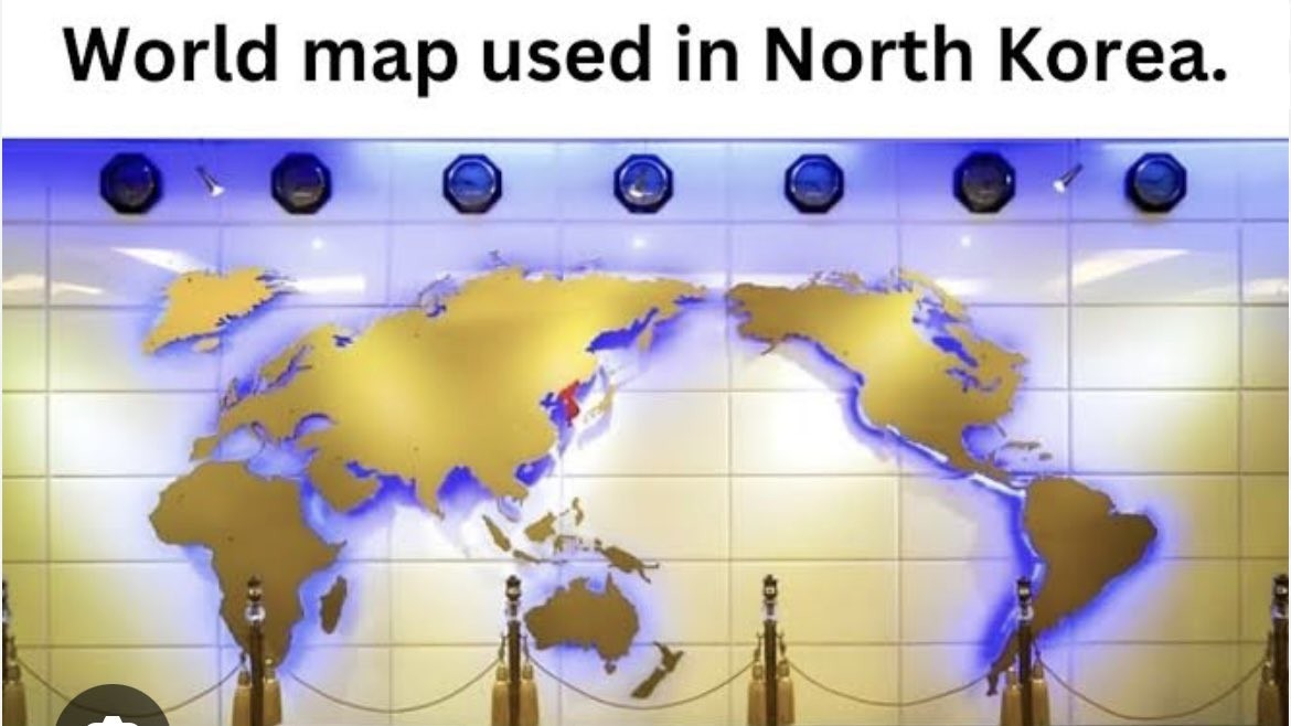
I'm no map understander, but I think the projection choice might have not been the best cause it seems to skew edges, while the part that it maintains has a lot of empty space (or maybe I'm just used to other maps). Though this is just a random map on a wall so 🤷
The solution is to create a new continent in the Pacific.
And it has New Zealand on it!
Fun fact: Whether North or South are "up" on a map is also completely arbitrary.

They undercut the message buy putting upside down at the top.
I had a teacher in high school who always set his globe that had the text oriented to the nearest pole to have the south pole on top. Anyone switching it would start a conversation about how there isn't a 'correct' up direction.
It makes as much sense as any other 2D projection of the globe.
Doesn’t the US sometimes use one that puts America in the center and cuts Eurasia in half? Can we agree this one is definitely stupid?
I've never seen that in the US. That is extremely stupid. Typically maps in the US center around the Atlantic/Europe.
At least it has New Zealand.
Don't the rest of the countries in the region use similar maps? South Korea, Australia, Japan...? I would expect that to be the case, it seems more natural.
Sea of Thieves lookin' map.
Projection aside, proportionally it's a bit whack and Japan is a bit too far north. Taiwan also seems to be inexplicably MIA, which would be understandable if it were omitted due to size but there are several smaller islands still depicted.
Perhaps the real point of interest is that it seems to depict the North and South Koreas as united with the whole peninsula colored in red. As usual for the Juche Boys, this is probably a tacit threat rather than any indication of potential armistice or reconciliation.
Friar tuck with a splash of bird turd to the noggin