Why would we stand for this. Take the streets. Bring your green hat.
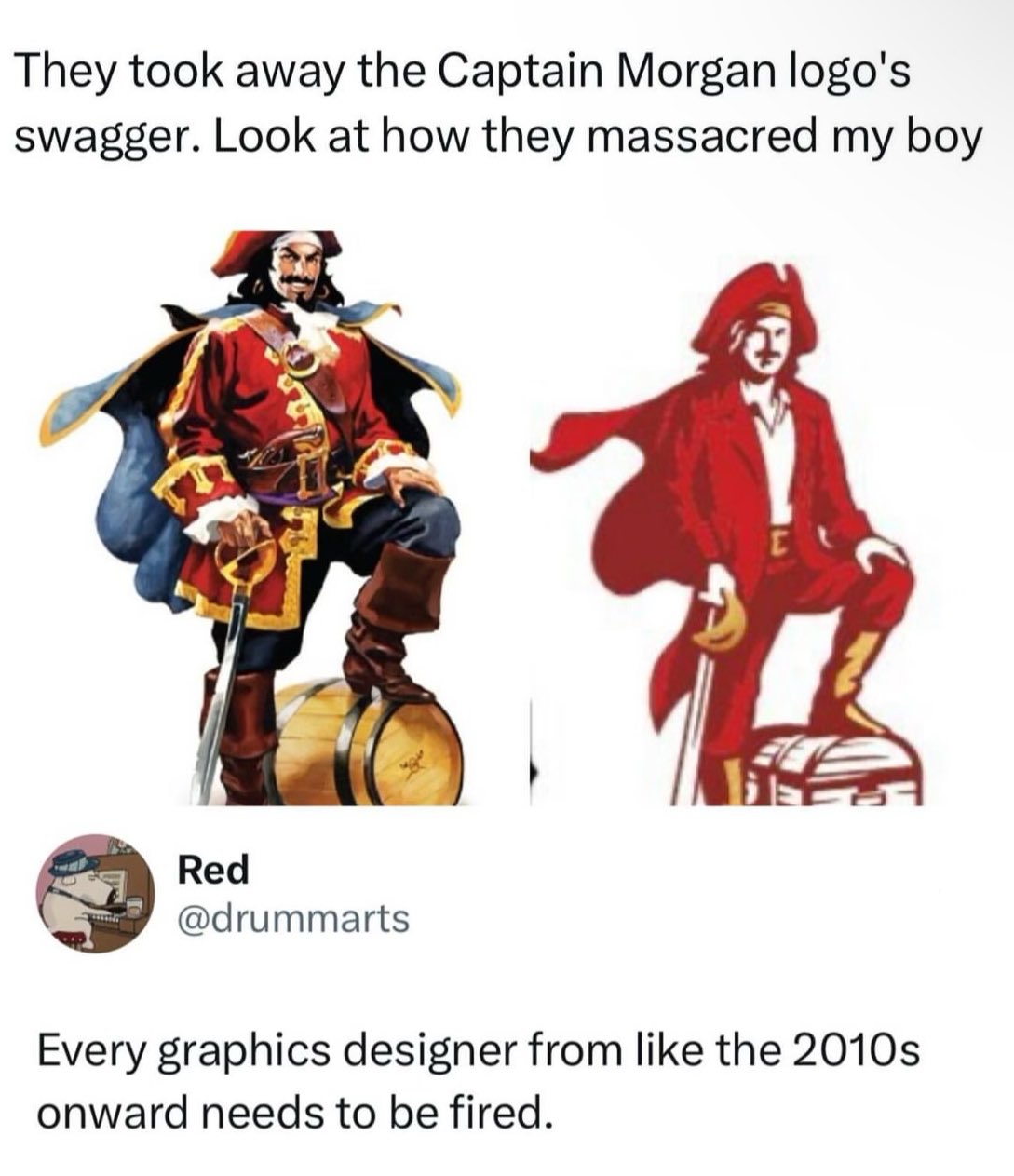
Whoever drew this and whoever approved this need to walk the plank.
Is it because they tried to make him less masculine?
Are you asking because you don’t know?
I honestly have no idea why they changed the logo
I think the cost saving on color printing like someone mentioned elsewhere makes a lot of sense.
At a time when mostly all corporations are raking in millions in profit, now they choose to reduce a small amount of color? Lol, it's funny
"they" lol.
It's not like Mr. Corporation said "Cleatus! reduce the colors needed to print this sticker! That's what's going to make us a profit for this quarter!" Instead, Cleatus and his logo team are incentivized to cut as much cost as they can because they get a bonus every quarter based on how much money they save the company. So someone on his team whose expertise is in label manufacturing for the company pointed out that they could save a fraction of a penny per sticker by reducing the amount and variety of ink it takes to produce the sticker.
That and/or someone in advertising has decided that now, statistically, is a good time to rebrand, and what I said above in combination with the current trend of minimalism means that this new logo fits all the criteria while saving money.
Poor captain. The light is no longer burning inside him, but defiantly he stands.
Say what you will, but that manager will now get a promotion for reducing the cost of production.
I mean, as far as these new logos go, it's not the worst.
People Twitter
People tweeting stuff. We allow tweets from anyone.
RULES:
- Mark NSFW content.
- No doxxing people.
- Must be a tweet or similar
- No bullying or international politcs
- Be excellent to each other.
- Provide an archived link to the tweet (or similar) being shown if it's a major figure or a politician.