Wow, this is great!
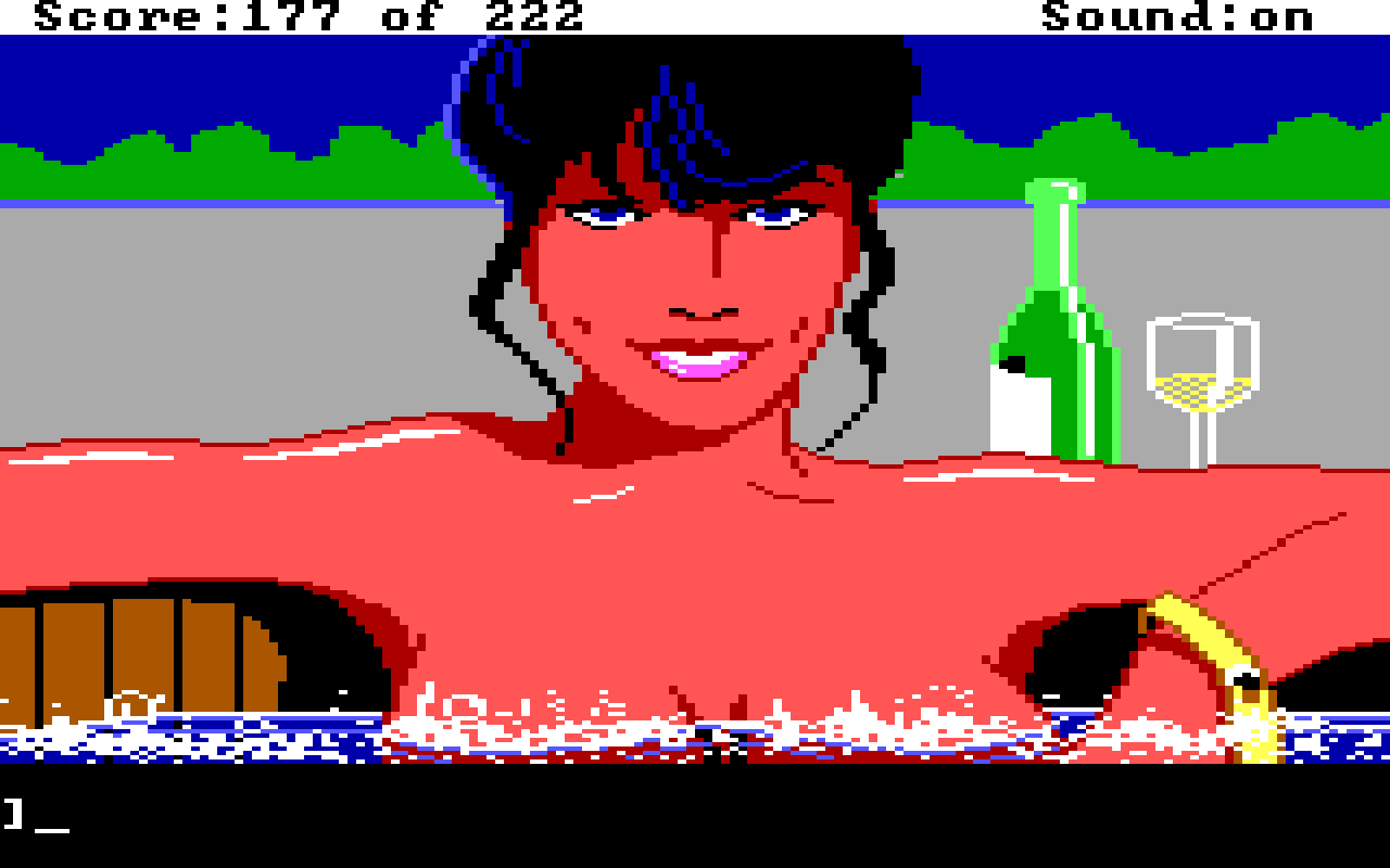
Here's the original pixel art from 1987, for the youngus amongus:

Wow, this is great!
Here's the original pixel art from 1987, for the youngus amongus:

Hmm.... this should be a webm video. Works (sort of) on desktop, but not in my lemmy phone apps. Back to the drawing board.
Fair observation. I need to do more to overcome the biases in the models.
⭐️ Red Dead Redemption 2. Specifically, the snowy town of Colter.
Gingers with asian facial features is messing with my brain. If thats what you're going for, great. But i found the negative embedding 'Style Asian Less' to be helpful in dialing the heavy asian over representation in the models back a bit.
SD is a rabbit hole for sure! These look good. Give "crepuscular rays" a try instead of "lens flare" to get something that looks a bit less photoshop-filtery.
Thank you! ♥️ Theres a bunch of really good alternates that didn't make the cut for posting, i need to figure out what to do with them but don’t want to flood the community. Thinking hat is on...
After seeing how well these came out, I'm already thinking of old games I could go through on a "location scouting" mission to create my own LoRAs.
These look great!
I'm guessing it's just the fantasy conversation between themselves and the... bank teller, accountant? Whoever she is, she's providing excellent customer service.
Golden hour is an entirely different lighting situation.
Golden hour is just after sunrise or before sunset, when the sun is above the horizon. Blue hour is when the sun is below the horizon, after sunset or before sunrise.
Really loving the work you put into this app.
On the profile header, could we get an option to have the more expanded appearance? I like seeing the banner art when people add that to their profile, but the new gradient overlay and position of the avatar and username obscure a lot of it now.
I tried to leave a tip, but the testflight version indicates the transaction would not be real. Is there a way to do that and still use testflight?