142
submitted 1 month ago* (last edited 1 month ago) by davetansley@lemmy.world to c/pics@lemmy.world
[-] davetansley@lemmy.world 51 points 3 months ago

Switched to Linux Mint about three years ago after being unable to take my perfectly good laptop from W10 to W11. Dual boot firstly, quickly becoming entirely Mint. It just worked. It was the first Linux distro I'd tried in about 20 years that I didn't mess up in a week or so.

Recently bought a new laptop and decided to distro hop. Tried various flavours of Fedora, and a few others, but ultimately came back to Mint. None of the others worked quite as well as Mint does for me (though I really liked KDE Plasma, and Gnome surprised me once I finally discovered extensions!)

116
submitted 9 months ago by davetansley@lemmy.world to c/pics@lemmy.world
[-] davetansley@lemmy.world 63 points 9 months ago

Working from home has its pros and cons. Fortunately, in my experience, the pros are all mine and the cons are all someone else's. That kind of colours my judgement.

105
submitted 10 months ago by davetansley@lemmy.world to c/pics@lemmy.world
[-] davetansley@lemmy.world 89 points 10 months ago

Clowns who think like this need to fuck all the way off... and, honestly, it's up to older folk like me to make that clear. Younger folks are going to be fooled or scared into thinking like this and be unable or unwilling to speak up. We who have less pressing concerns need to have their backs.

105
Early Morning [OC] (lemmy.world)
[-] davetansley@lemmy.world 49 points 1 year ago

Why did its valuation tank after Elon Musk took over and started enacting his policies? Perhaps we'll never know...

195
submitted 1 year ago* (last edited 1 year ago) by davetansley@lemmy.world to c/retrogaming@lemmy.world

Just in time for the spookiest time of year, a game that features not just ghouls, but also ghosts as well. And spooky haunted turtles.

Ghouls 'n Ghosts (Dai Makaimura in Japan) is a classic 1988 Capcom arcade game and sequel to the highly popular Ghosts 'n Goblins. Like its predecessor, you play Arthur, a knight who must save a princess by battling through six spook-filled levels. Along the way, you collect a variety of weapons (sometimes against your will!), beat bosses, avoid wizards in chests, and generally work your way from left to right. You get two hits per life, with your armour disappearing after the first. To help you out, you can collect a golden set of armour that has a charge attack, but you seldom get a chance to use it.

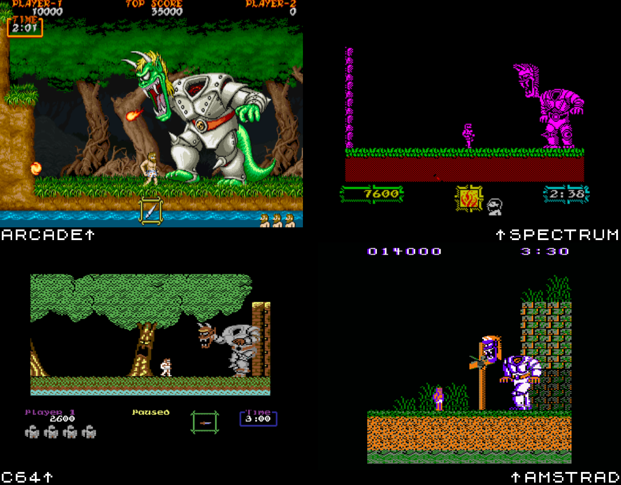
The arcade version of Ghouls n Ghosts

The arcade original is just gorgeous in every respect, with masterful pixel art graphics, music that is both spooky and catchy, and controls that feel fluid and responsive. Its levels are varied and interesting, and its bosses challenging. In fact, the whole game is a challenge, with the difficulty ramping right up from the end of level 1. You're never given a moment to breathe, as zombies continually spill out of the ground and attack you. Gotta keep those quarters coming! And if you pick up the wrong weapon (basically anything but the knife), you're stuck with it, unless you chance upon a better pick up.

The game was ported all over the place, with varying degrees of success. It came towards the end of the life of the 8-bit micros, so hopes wouldn't have been high... so how did they do? Actually, not bad. Let's take a look.

The Amstrad version of Ghouls n Ghosts

There's not a lot to pick between the 8-bit and 16-bit micro versions, with each of them suffering similar problems, the worst of which is the limitations of a single-button joystick. This means that firing upwards (an essential part of some levels) is combined with an initial jump, causing you to jump into the enemy you're trying to dispatch!

The Amstrad suffers all of this, but also some pretty gross push scrolling, which makes it difficult to avoid some enemies. It otherwise looks okay, I guess, with colourful, distinct graphics. It controls fairly well, despite the scrolling limitations, but it is definitely the hardest of the three 8-bit micros. Sound is pretty much non-existent in-game, but it has a lovely title screen rendition of the Ghouls 'n Ghosts theme. Shame it couldn't play in-game.

Not a bad effort, if a little clunky.

The C64 version of Ghouls n Ghosts

The C64 version is distinct from the Amstrad and Spectrum, as is fairly common with games from this era. It has much smaller graphics, but some lovely smooth scrolling. Some of its levels feel incredibly sparse, with very few enemies, which makes it a lot easier than the Amstrad version. Unlike other 8-bit versions, the C64 version has in-game music... though, inexplicably, opts for a custom theme rather than the very familiar Ghouls 'n Ghosts music. It's very good, but also feels very out of place...

The Spectrum version of Ghouls n Ghosts

I start a lot of these Spectrum sections with "you'll have to trust me on this...", and this game is no exception. The Spectrum version shares a lot in common with the Amstrad version, but the overall package is a lot slicker. The scrolling is smooth (at least for a Spectrum), the sound is better, and the control feels fluid and "right". This version, of the three 8-bit micros, feels the most like the arcade. That said, it looks very basic, and is certainly the worst looking of the three, with monochrome graphics that feel sparse and bland. But what did you expect?

Not a bad effort though, and well worth a look for those interested in seeing this ancient machine pushed to its limits. You just need to squint a little...

The Amiga version of Ghouls n Ghosts

Sigh. There's just something deeply disappointing about playing Amiga arcade ports from this era. It's how a teacher must feel when an obviously gifted student just phones it in and scrapes a D. Amiga Ghouls 'n Ghosts is that kind of port... It looks kind of okay in stills, but when it moves it reveals itself. Slow, jerky scrolling. Lacklustre colours. A small playfield... Like the C64, it goes its own way for music on level 1, and while the tune is suitably spooky, it just never seems to get going.

Overall, its not a terrible port. Its certainly playable. Its just... the Amiga could do so much more, you know?

The Master System version of Ghouls n Ghosts

Over on the consoles, things were a lot better. Starting with the most basic conversion, that of the Sega Master System, we begin to see a lot more of the original's DNA. The music is here in-game, a plinky plinky chip tune rendition of the original that is perfectly serviceable. The graphics are good and colourful, if a little blocky. It plays really well, and even adds in some light RPG elements in the form of shops in which you can upgrade your equipment. Not sure why this version alone got that addition, but it certainly adds depth.

Overall, I think you'd be happy with this if you were a Master System owner in the late 80s.

The Megadrive version of Ghouls n Ghosts

Over on the Master System's big brother, we have perhaps the most impressive port of all (though not the most accurate). Programmed by Yuji Naka (of Sonic The Hedgehog fame), the Megadrive port is extremely competent. Everything is here and incredibly faithful to the original. The music is amazing, managing to sound both faithful and unmistakably Megadrive. The graphics are on point, with just a slightly gaudy palette letting it down slightly. Best of all, it plays incredibly well.

If you want to experience just one "interpretative" port (rather than one of the identical or emulated ports), give this a go.

The Supergrafx version of Ghouls n Ghosts

A rare spawn - a Supergrafx version! This little known successor to the PC Engine got very few games, and Ghouls 'n Ghosts was perhaps the most famous. Like the Megadrive, it's a highly faithful and very impressive conversion. Its graphics are perhaps a little more detailed than the Megadrive, with a more refined palette that can sometimes look a little drab. Still, it's a brilliant conversion, and well worth a look (if you can track it down!)

The X68000 version of Ghouls n Ghosts

Onto the Sharp X68000 "port"...

It's hard to know what to do with this version (and the Playstation one), since they don't hit the same curiosity triggers as, say, the Amstrad version. It doesn't really feel like a conversion at all, it feels exactly like the arcade game. And with good reason... the X68000 shared a lot of hardware similarities with the arcade games of the time, and was even used by Capcom as the CPS development machine. So of course it feels great.

But we're here to see the brave leaps of faith and the tragic failures of ambition... and this ain't that.

Still, if you want to see a truly arcade perfect port of Ghouls 'n Ghosts, have a look at this...

The PS1 version of Ghouls n Ghosts

... Or this. The PlayStation version is, presumably, using some kind of emulation and a dump of the arcade ROM. As such, I'm tempted to disqualify it... but I wanted to include it purely to point out that even this method doesn't always guarantee perfection.

There's something busted about the brightness in this version. It's way too dark. For my screenshots above, I've had to give it a bit of a crank up a notch or two - unscientific, yeah, but otherwise it was very hard to see anything! It could be a problem with my MiSTer, but the few YouTube videos I've seen suggest the same problem...

So there you have it. Ghouls 'n Ghosts, a cool game wherever you play it, and a very hard one at that. Try the Megadrive/Genesis port, if you can try just one.

Happy Halloween! 🎃

146

I'm not normally one for themed, seasonal gaming... but Halloween seems to lend itself particularly well to playing a particular type of game.

So what are you playing this spooky season?

This year, I'm playing through Castlevania: Dawn of Sorrow (DS version, via the Retroid Pocket 2S). It's not the spookiest entry in the series, but has enough creepy castle exploration to fit the bill.

464

(Saw this question asked on another popular link aggregation website and it got me thinking)

If you could play one game for the first time all over again, what would you choose? This might be because you want to do it all again, or because you don't think you got enough out of it the first time. It could be experiencing the game exactly as you were back then, or experiencing a game with what you know now.

For me, it's Legend of Zelda: A Link To The Past, experienced exactly as I was back in 1991.

Nothing comes close to how jaw-droppingly amazed I was by that opening sequence. The epic orchestral score, the cinematic rainstorm, creeping around in the dark... it was a generational leap above anything I'd played on 8-bit computers and consoles, and even the Megadrive. I'd love to play it again without thirty plus years of Nintendo/Zelda knowledge, or without knowing about the dark world.

[-] davetansley@lemmy.world 29 points 1 year ago

Pretty much all of them... I have so many memories of old 80s computer games where all I remember is level 1. It appears that I was terrible and perfectly happy with that.

94
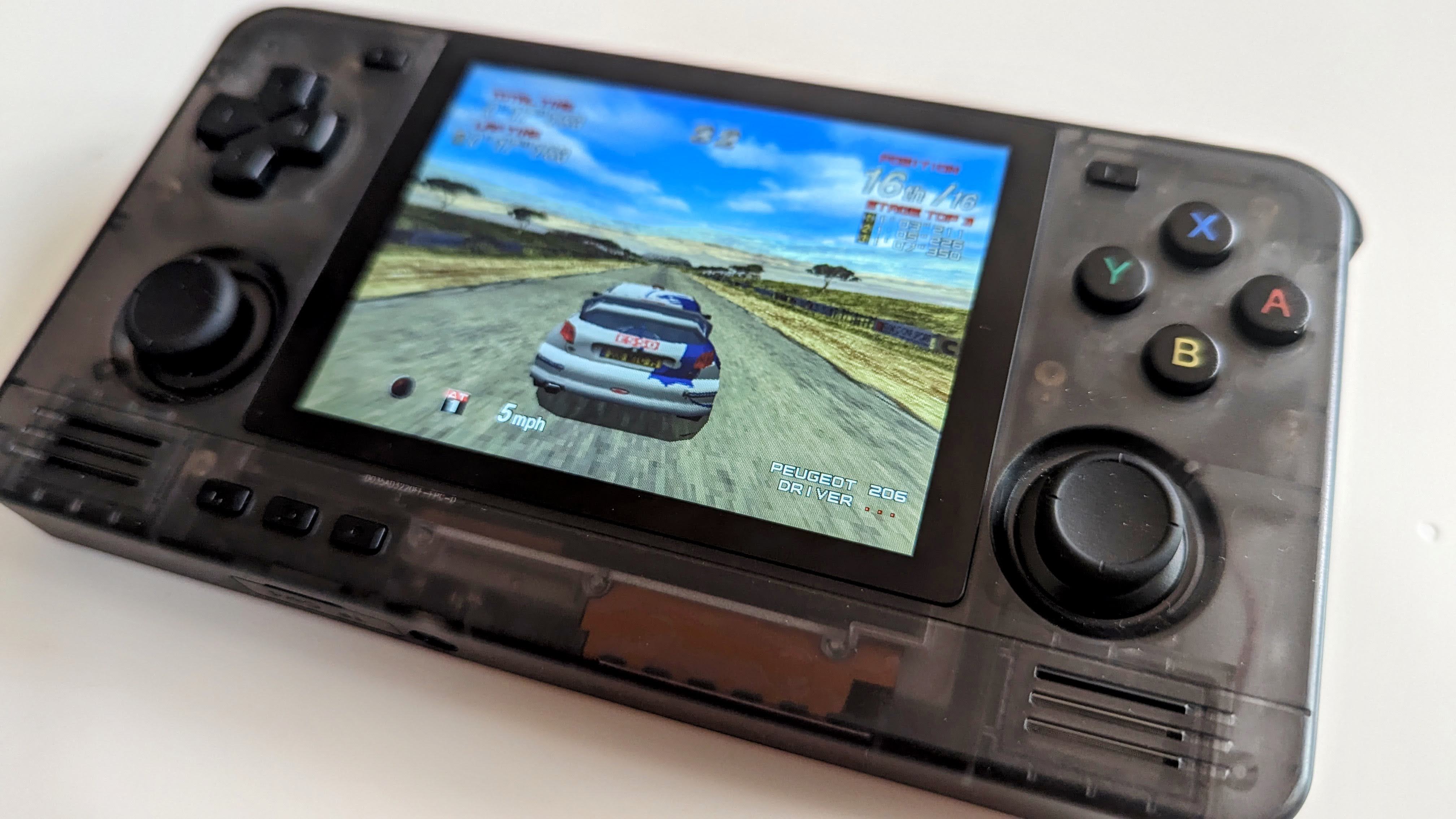
Retroid Pocket 2S (lemmy.world)

cross-posted from: https://lemmy.world/post/4790038

I got the new Retroid Pocket 2S in clear black. It worked out about 105 quid delivered, and took just over a week to arrive.

It's a lovely little device, with some really nice sticks and triggers. But it really hammered home how easy it is to set up a Miyoo Mini Plus (which was largely just a case of copying over the ROMs). This one comes pretty much barebones, and it's up to you to install all the emus and a decent front end. So you end up with a weird combination of Retroarch and stand alone emus, and a confusing set of different configs. Retroarch alone is an absolute beast to understand and get right...it seems to have a slippery complexity that is very difficult to hold in your brain.

That said, once it's set up, it is lovely. I'm using Daijisho as a front end, and it pretty much hides all the underlying complications. 4:3 systems look great on the tiny screen, and it runs up to Dreamcast really well, with some GC games running nicely. The only downside is that the PSP's 16:9 screen looks a little titchy letter-boxed on the screen, but it's a small price to pay for portable Outrun 2.

Overall, very impressed... though concerned that this is my second retro handheld and I'm already thinking about things that would make me pick up a third. These things are compelling, eh?

2

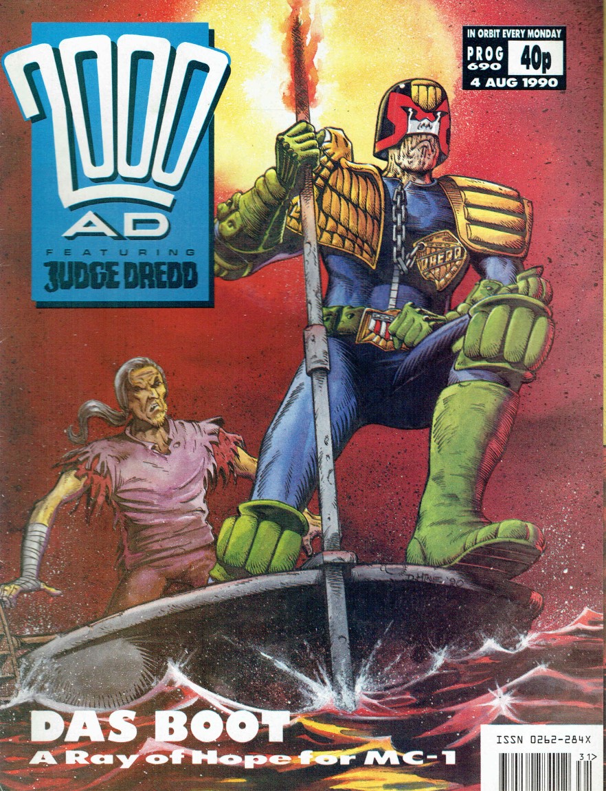
For me it was 2000AD 690. Picked it up on a whim as a 15 year old on begrudging holiday with my family. It was bang in the middle of the Necropolis story, and everything about it seemed fascinating to me...

It caused me to collect both forwards and backwards, desperate to know what had happened before (which was a lot, since this storyline had been brewing for years) and what happened after.

It was also a gateway drug into US comics, primarily Marvel, but pretty much anything that looked cool at the time. I still have all my physical books, stored in a bunch of long boxes up in the attic that I swear I'll get down and look at one day, but never do...

Which issue was your gateway drug?

195

Commando (released as Senjō no Ōkami in Japan, Wolf of the Battlefield) is a 1985 Capcom arcade shooter. Word to the wise: Commando isn't based on the Schwarzenegger movie of the same name - that's some false knowledge I've carried round with me for close to forty years... oh, how I've embarrassed myself at dinner parties...

The arcade version of Commando

Commando is a vertically scrolling run-and-gun shooter where you play "Super Joe", a one-man army pitted against the endless ravenous hordes of whatever country was the mid-80s enemy du jour at the time. You have a gun with unlimited ammo, and a finite supply of grenades with which to dispatch your foes. While the gun can fire in any direction, the grenades only launch upwards, which creates a need for careful positioning in order to use them effectively.

The game is split into levels, and each level ends with a heavily fortified building that spews out a huge number of enemies that must be defeated before you progress.

It's a cool game, one of the first of its kind. It's also fast and frantic, and doesn't really reward slow and methodical play. You've almost got to treat it as an auto-scroller, never slowing down, just moving forward and spraying your gun wherever you can. If you don't, you risk being overwhelmed by the constantly respawning bad guys.

It was a genre defining title, spawning many imitators (such as Ikari Warriors, the home Rambo games, and countless others; as well as a 198 sequel, Mercs). It was also extremely tough, especially the unforgiving end-of-level sequences. A real coin muncher.

In terms of ports, it got more conversions than a corrupt third-world regime has cannon fodder mercenaries. And I've looked at them all... war is hell, man.

So, lock and load, we've got a lot to get through...

The Amstrad version of Commando

We begin this epic journey with a familiar friend: the Amstrad. But it's not up here because it's terrible, far from it. It's actually a pretty decent conversion, albeit not as good as the Spectrum or C64. Like the Spectrum, it suffers a bit from its one-button joystick, meaning that grenades are fired by holding down the button, which leaves you a little vulnerable for a moment. I think I prefer the C64's approach of using the space bar for this.

The graphics are bold and clear, if a little monotonous; the game is hard, but fair; and the sound is... okay. Overall, it's fine. Not the best, not the worst.

The Spectrum version of Commando

The Spectrum port of Commando is good, seriously. It just looks bloody awful. Not sure why they chose yellow as the background colour, but they did and you end up feeling like you're wading in custard. It's not the only port to feel like this.

If you can ignore the stinky visuals, there's a great game underneath. It is fast, similar in pace to the arcade and has a similar frantic feeling. It throws hordes of enemies at you, just like the arcade... no idea how the Spectrum keeps up! Bullets are very visible, making it feel fair, even the sound is okay.

Overall, a great effort!

The C64 version of Commando

I think C64 owners would claim Commando as their very own, and with good reason. It's very much a C64 staple.

It's the theme music, you see? A Rob Hubbard classic, famously knocked up in 12 hours. And it's great! But beyond the awesome SID soundtrack, the game is amazing as well. Smooth, fluid, fair, fast, it just feels right. On the 8-bit micros, at least, it is the closest by far to the arcade.

You could, perhaps, argue that it is a little bit... brown. But hey, so was the original. And it worked for literally every Xbox 360 game, so I'm prepared to let it slide.

Well worth a look, even today!

The BBC Micro version of Commando

We leave the well-trod paths of 8-bit machines and enter the hinterlands...

The BBC Micro, for those not raised in the UK in the 80s, was a machine that was only ever owned by the children of geography teachers. It was never meant to be a games machine, it was meant to be for learning or a tool for recreating the Doomsday book (don't ask).

Nevertheless, it turned in a commendable effort on its Commando homework, a solid B-.

Yet another victim of the yellow backdrop curse, this effort is garish and bright. It is also pretty slow, with jerky movement. That limitation kind of changes how you play the game. It becomes more intentional, less frantic. You can take your time a little, plot out the best place to stand and fight. In that respect, it's quite enjoyable.

So a reasonable effort, if a little... yellow.

The MSX version of Commando

Sadly, the same can't be said about the MSX version, which isn't so much a war hero, as a war crime.

It looks passable in still form, with colourful graphics that are reminiscent of the arcade. It has that old MSX thing of a multi-colour main sprite and monochrome enemies, but looks mostly fine. Sadly, it all comes apart when it moves... the main sprite jerks from character block to character block, the screen moves similarly badly. It's like viewing Commando through a flashing strobe light. The music is discordant and jarring, and plays in half-hearted 20 second bursts before giving up. Really off-putting.

It's a shame, because it has all the elements of the arcade in one form or another. They're just put together in such a way that makes playing it feel like having a seizure.

The Amiga version of Commando

Enough with the garish 8-bit ports, let's take a look at what the 16-bit powerhouses can do...

The Amiga turns in a solid effort. Pretty boring really, leaving me very little to comment on. It's Commando... slick, smooth graphics, solid controls, a nice rendition of the arcade music. It's enjoyable to play, but doesn't really push any limits...

If you want solid, authentic competency, this is the port for you. But where's the fun in that?

The Atari ST version of Commando

Similar to the Amiga version, the Atari ST phones in another competent port. In fact, I actually prefer this version to the Amiga version. It feels looser, smoother, a bit faster maybe? Regardless, there's not much in it, with both versions having near identical graphics. The ST music is a bit chippier, but it still sounds authentic.

Another great port!

The Intellivision version of Commando

Regular readers of these posts will know that what I value more than lazily applied raw power, is moxie. And this port has moxie in spades. It's an Intellivision, for goodness sake! From 1979! It has 1K of RAM! This machine has no business running a game like Commando... and yet...

Okay, it doesn't look much like the original, with the chunky colourful sprites being whittled back to one colour stick men. But it moves kinda like Commando and it sounds kinda like Commando and it plays kinda like Commando. All of it powered by sheer moxie alone!

It's not the best port here by a long way, but it is perhaps the most impressive. Importantly, it's also very playable, enjoyable even! It has moxie, see?

The Atari 2600 version of Commando

Now, there's moxie and there's wishful thinking, and the Atari 2600 (hailing from 1977) was more of the latter and less of the former. If the Intellivision port embodies the spirit of Commando, the Atari 2600 embodies the spirit of a two sentence description of Commando. It is super basic, super stripped back, and it doesn't really work, sadly.

The graphics are limited, with yet more liberal use of yellow; the movement is perfunctory; the bullets frequently go missing and can't be avoided, and it's annoying to play rather than quirky.

There are good 2600 games, games that are enjoyable even today, but this isn't one of them. Well, what do you expect? The console is basically just resistors!

The Atari 7800 version of Commando

Luckily for Atari console fans, the Atari 7800 version is actually quite good. It's a proper grown-up console version, comparable to the NES port, and very playable. It has all the bits and pieces from the arcade, and adds pick-ups to give you a more powerful gun, or a knife to enable hand to hand killing (run into enemies).

It looks great and moves smoothly and, if you're playing the original cartridge, it uses an extra POKEY chip to give enhanced sound (one of only two 7800 games to do so).

The NES version of Commando

The NES version of Commando is probably the best of the bunch, possessing that slick console feel that leads to such great coin-op conversions.

Superficially, it's a solid recreation of the arcade. It looks great, it sounds as good as can be expected, it is smooth, fast and frantic. It sometimes pushes the limits of the NES too far though, with the abundance of on-screen sprites causing some pretty epic sprite flicker. But you barely notice it in the heat of the action.

Like several other NES conversions (Rygar, Strider), this one adds a number of little extras to prolong interest. It has powerups that can be collected for points or to make your weapons more powerful. Also, hidden around the levels and revealed by a well-placed grenade throw, are ladders. If you climb these ladders down, you're taken to a hidden bunker, containing either hostages, enemies or pick-ups. It doesn't add a great deal to the game, other than the need to locate these ladders, and you could even argue that it detracts from the frantic pace. But it's an interesting example of how developers tried to add a little bit extra to coin-op conversions back then.

So there you have it, Commando. If you want to experience it today, try the C64 or NES versions for realsies, or the Intellivision version for interest.

234
submitted 1 year ago* (last edited 1 year ago) by davetansley@lemmy.world to c/retrogaming@lemmy.world

I feel as if I've been hanging out at the arse-end of the 80s a lot recently, comparing ports on computers that had no business running them. I've long suspected that if you want to see 8-bit micros at their best, you're better served hanging around in 1986 rather than 1989. Things were so much more achievable back then...

So, with a robust tailwind of realistic expectations at our backs, let's take a look at Tehkan's 1984 arcade hit, Bomb Jack.

The arcade version of Bomb Jack

Bomb Jack is one of those much-loved arcade classics that everyone knows but which never quite reached the same revered status as earlier hits like Donkey Kong or Pacman. It came at that inflection point in the arcades where single-screen, high score games were being replaced by more complex, sprawling coin-munchers. A kind of last-hurrah for wonderful simplicity.

And Bomb jack truly has simplicity. It is played over five backdrops, where you play "Jack", a caped superhero, who is tasked with defusing a number of bombs that are sprinkled around the level. As you begin to collect them, a single bomb's fuse will ignite. Collect this, and you get a 200 point bonus and cause another bomb to light. Getting the highest score becomes a matter of strategically collecting the fizzing bombs and avoiding the unlit bombs. Or you could just collect bombs regardless and forgo the extra points.

Standing in your way is an array of bad guys, from killer robots to um... birds. But you're not entirely defenseless, as you can pick up a "P" power-up that renders all enemies vulnerable and stationary, kind of like the power pill in Pacman.

Ultimately, Bomb Jack is a game about movement. Jack can jump high into the air and, with a tap of the fire button, float slowly back down to earth, enabling you to collect the higher up bombs. This requires a bit of skill to master, and you'll need to use the float mechanic to avoid the screen's enemies.

To emphasise this vertical motion, Bomb Jack's cabinet comes with a 3:4, "tate" mode monitor.

Overall, it's a fun, bright score-chaser game, well worth a quick look. But how did it look on the home versions?

The C64 version of Bomb Jack

Oof. Slipping sheepishly into the hated first slot is the C64 version, easily the worst of the bunch. There's no reason why it should be, it just feels full of unforced errors. Like how chunky everything is. The Bomb Jack sprite and the enemies are just too big. It's difficult to move, difficult to soar, difficult to sneak in for swooping bomb collection moves. It's also muddy and grim, with some backgrounds being inexplicably the same colour as the bombs.

Uniquely, among the original home ports, this version has a clunky rendition of Jean-Michel Jarre's Magnetic Fields playing in the background. But not even the Synth Pop King can save it from its grizzly fate.

The C16 version of Bomb Jack

Listen, as an old ZX Spectrum advocate, I appreciate moxie. And the C16 version of Bomb Jack more than makes up for its technical shortcomings with a generous dollop of moxy and chutzpah. It's ambitious in a way that 16k machines shouldn't be, and for that, it merits a flamboyant doff of the cap.

But for all that it plays a surprisingly okay game of Bomb Jack, it's not amazing. For a start, it cuts down the number of backdrops to one or two, with subsequent levels being rearrangements of the platforms over the same background image. It's also very grey and dark, and it suffers the same chunky-monkey shortcomings as its big brother, the C64.

Still, B+ for effort.

The Amiga version of Bomb Jack

A bad day for the Commodore brothers...

While the C16 achieved a lot with precious little, the Amiga does sod all with a great deal. It feels like one of those early Amiga ports where the devs weren't quite up to speed with the powerhouse they were coding for, but it was actually released in 1988, two years after the 8-bit ports. For a game released in the middle of the Amiga's life, it plays remarkably badly.

Movement is slow, laboured, stuttering. The graphics are bland. The three-bar theme music is infuriating... overall, a bad, bad port.

The Atari ST version of Bomb Jack

Sidling up alongside the Amiga version, wearing a self-satisfied smirk on its face, is the Atari ST version. Normally the sickly cousin of its 16-bit rival, the Atari ST somehow manages to win this inconsequential encounter. Its port looks virtually identical to the Amiga version, but it moves so much better. It is fast, fluid and plays largely the same as the arcade. Even the AY sound is inexplicably better.

Word to the wise: By default, the ST version has "Mouse" as its initial control scheme. Yeah, I don't get it either. If you don't spot this, you may almost write it off without realising it's actually pretty good!

The Amstrad version of Bomb Jack

What's this? An Amstrad port sneaking ahead of the pack? Yep, it doesn't happen often, but the Amstrad version of Bomb Jack is actually pretty solid. It's appears to be based on the Spectrum version, but with a characteristically Amstrad-esque colour scheme (garish).

It plays well, fast and fluid and with plenty of space to enjoy the soaring movement. Overall, not bad!

The Gameboy version of Bomb Jack

There's something uniquely reassuring about a console port, especially when viewed alongside home micro ports. They tend to have an extra level of polish, a feeling that the devs haven't just spent all their time working out how to get the thing to run, but also how it feels when it does run.

The Gameboy port is a lot like that. It's Bomb Jack, sure enough, shrunk down, monochromed into that love-it-or-hate-it Gameboy green... but it feels so much better than the other ports. Movement is fluid, at a solid framerate. It feels more balanced. It has continues! Overall, it feels like a more modern experience.

Then again, this version was released in 1992, a full 6 years after most of the 8-bit ports, and a lot of "user experience" water had passed under the bridge in that time.

So for all that it is a great port, I'm going to have to mark it down slightly. Sure, it's a fun version of Bomb Jack, but why wouldn't it be? It was released in the same year as Streets of Rage 2!

The Spectrum version of Bomb Jack

Blimey! Taking the top spot, surprisingly, is the ZX Spectrum version... no, wait, hear me out...

I know I come across as a bit of a Speccy apologist and, I admit, I served my time in the Platform Wars of the 80s. I've made baseless arguments about the Spectrum's capabilities that fly in the face of sense and logic at times. But, this time, I feel such hyperbole is warranted.

See, Bomb Jack feels ideally suited to the Spectrum. It doesn't require any fancy scrolling, it is bright, it demands a reasonably high res screen and a fairly nimble CPU to move things around quickly. And those are things the Spectrum can do.

Sure, our rubber-keyed pal opts for "any colour as long as it is black" for the sprites and platforms, but it kind of works. It lets the backdrops be outrageously colourful, just like the arcade. And it plays well too, moving just like the original, or so it seems to me. It feels right in a way that the Amiga and C64 ports don't. Even the humble 48k sound isn't terrible... bleeps and bloops and warbling jumps.

I don't say this often, but if you're going to play a port of Bomb Jack, you should definitely check out the Spectrum version...

1
submitted 1 year ago by davetansley@lemmy.world to c/retroid@lemm.ee

Russ at Retro Game Corps seems to like the 2S, and I'm tempted myself. Is anyone planning to pick one up?

[-] davetansley@lemmy.world 59 points 1 year ago* (last edited 1 year ago)

It's interesting how far Linux desktop has progressed recently... I don't hate Windows, in fact I think it's a great OS for most purposes. But I happened to try Linux Mint a few years ago in a fit of pique about being excluded from the Win11 upgrade for spurious reasons... and it just kind of stuck.

Two years later and I am full on Linux now. Don't even have a Windows partition (though I do keep a VM). And I'm about to buy a new laptop that I intend to buy without an OS, it will never be touched by Windows, there's just no need.

For my purposes, Linux does everything now. OS, software, the games I want to play... I never even think about it. Also, everywhere I look, I see Linux - my Steamdeck, my MiSTer, my Pis, my Miyoo Mini. It's everywhere...

[-] davetansley@lemmy.world 45 points 1 year ago

Yeah, me too. From a consumer perspective, music streaming (not just Spotify) has managed to remain a worthwhile offering, the kind we all said we'd be happy to pay for if it just existed back in the piracy age...

Contrast with video streaming, where you now need to have five different subscriptions just to have a hope of watching half the things you want, where the content changes all the time and geo-limitations abound.

Take my extra quid, Spotify!

[-] davetansley@lemmy.world 33 points 1 year ago

I really wish they'd drop the YouTube Music aspect of this and just do an ad-free YouTube sub. Happy to pay content creators for their work; less happy to give Google money for a music platform after what they did to Google Music.

[-] davetansley@lemmy.world 46 points 1 year ago

On mobile, I'm using the Voyager app, which lemmy.world has installed as an alternative front end. Seems to work great.

On desktop, I'm using the amazing Alexandrite UI (https://alexandrite.app/) which solves all of my interface annoyances with the regular Lemmy UI (infinite scroll, opening posts without losing place in the feed, easily accessible communities list).

I love how flexible Lemmy is proving with its UI options... there really does seem to be something for everyone!

[-] davetansley@lemmy.world 29 points 1 year ago

All workers are required to enjoy 30 minutes of mandatory social engagement at a designated "Fun Area". Enjoyment activities can include: hearty laughter, corporate value appreciation, appropriate camaraderie. If the enjoyment you wish to experience is outside of these allowed forms, please speak to your department's Enjoyment Adjustment Officer.

[-] davetansley@lemmy.world 96 points 1 year ago

I guess that explains why they're going to such great lengths to convince us that talking about Game of Thrones around a water cooler is such a tremendous benefit to humankind...

[-] davetansley@lemmy.world 85 points 1 year ago

Leaving Twitter for Mastodon barely had an impact. I was just about done with that whole place, with or without Musk in charge.

Reddit is different... I still loved using it. I had my subscriptions honed, all my interests represented. I suffered none of the toxicity that others saw. Not sure if that was just because I mostly used smaller, niche-interest subs or because I mostly lurked and seldom posted? It was all friendly, knowledgeable and entertaining, a stream of consciousness that I could dip in to whenever I wanted to.

So I'm not leaving Reddit because of the experience, but more on principal (both the API kerfuffle and a general aversion to ad-revenue models, which are clearly harmful to society). Principals sadly don't give me something to read over breakfast...

I hope Lemmy can become that stream of consciousness in time. I'm trying to do my bit by being an active contributor rather than a lurking grazer.

view more: next ›

davetansley

joined 1 year ago