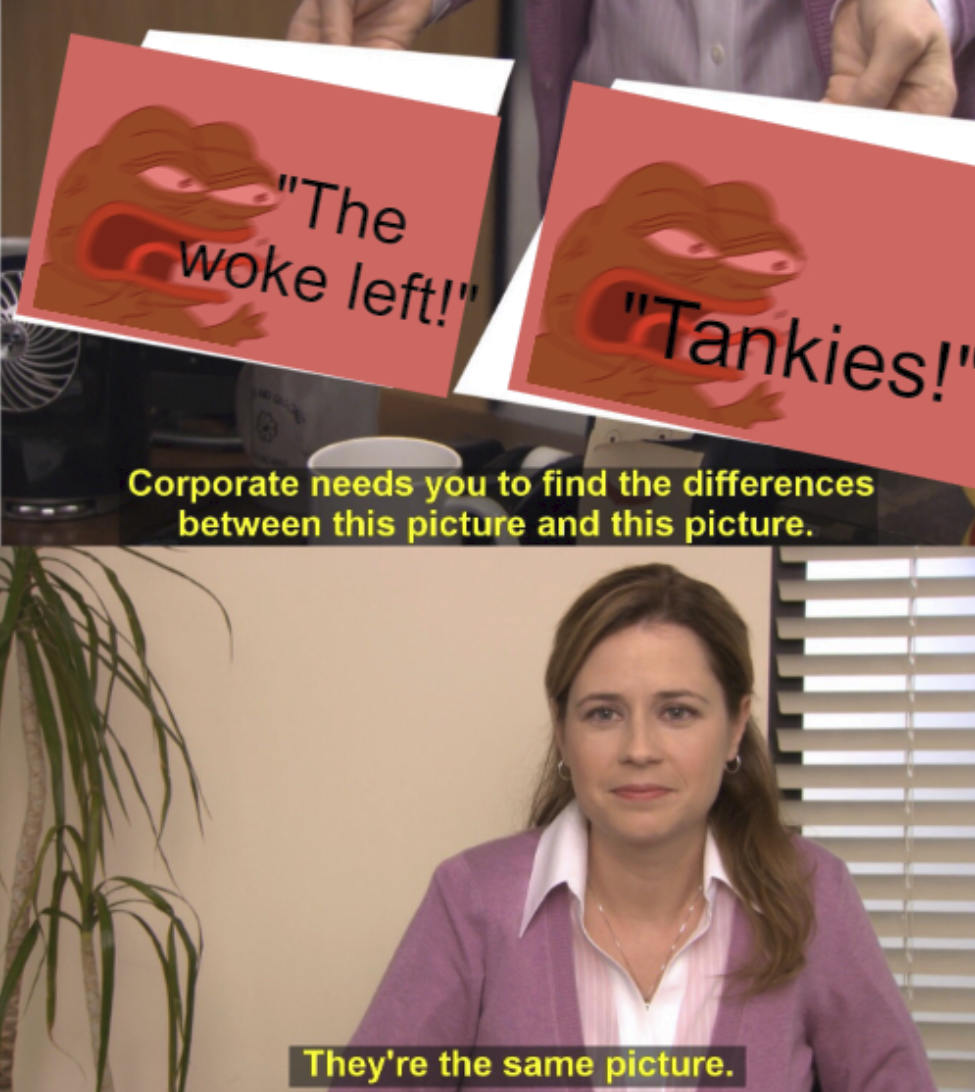
Probably not the most, but:
“Capitalists are job creators.”
The jobs will exist with or without them.
WaPo just publishes Bezos's marketing emails.
lol you didn't even bother clicking the link did you?
VOA is part of the U.S. Agency for Global Media (USAGM), the government agency that oversees all non-military, U.S. international broadcasting. It is funded by the U.S. Congress.
Type: Statutory corporation with a royal charter
A statutory corporation is a government entity created as a statutory body by statute.
It doesn't matter what language you try to couch it in, "state funded", "editorial independence", whatever. It was founded by the state, is funded by the state, and is a government entity. If it quacks like a duck.
mediabiasfactcheck, the site that squashes two complex spectrums (left vs right, unbiased vs biased) into a one dimensional line, making no distinction between centrism and being unbiased.
and reliable reporting as you can get outside the BBC
"Russian state owned media bad. British state owned media good."
I guess you’re just assuming it’s bad based on its name
No, we know it's bad because it's literally run by the US government.
Putin isn’t a Nazi, Prigozhen is.
And even if it was Nazi vs Nazi, you shouldn’t be rooting for either side.
Why are you rooting for the Nazi private military?
Generally aligning stuff isn’t nice. But if you do, it’s tabs up to whatever level of indentation you’re at then spaces the rest of the way. So you wouldn’t have to assume a tab size. And the tabs and spaces have different semantic meaning (indent vs alignment) so mixing them makes sense. It's even built into Jetbrains IDEs, where it's called "Smart Tabs".

Although really just adding a level of indent is better than aligning.

Hi, I'm a dev from hexbear and it looks like my first UI changes (relating to post listings) were included in this release.
Here are the changes I made:
- Expanded image and body now show below the rest of the listing.
- And also offset to not be under the votes and thumbnail.
- Post title doesn't jump to a new line when you expand the image.
- Thumbnail doesn't disappear when you expand the image.
- Does not apply on mobile since things don't jump around as much.
- Clicking expanded image opens the original in a new tab.
- Does not apply on mobile since you can just long press.
- Instead tapping the image closes it.
- pictrs images now prefer the original format over jpg.
- Rendering split into many functions to improve readability.
- Post actions are now on the same line as the comments button.
- Post actions now show on mobile.
- Comments button made larger.
- Expanding or contracting an image now expands or contracts the body.
I'd love to hear any feedback or ideas anyone here may have.

Sounds like a coup might be incoming.