[-] sixdripb@lemmy.world 2 points 6 months ago* (last edited 1 week ago)

good info thx!

1
submitted 6 months ago by sixdripb@lemmy.world to c/trap@lemmy.world

thook is a pioneer bro

[-] sixdripb@lemmy.world 2 points 7 months ago* (last edited 7 months ago)

aw I missed the release. maybe we can get it in for the fall release. ( personally I would prefer to get it in under the right license, than in a new one or in a grey-area). thanks for reaching out back then, it would be crazy to me if people had access to this icon in neovim etc.

[-] sixdripb@lemmy.world 2 points 7 months ago

same experience, thank you for asking

I could not understand if I messed something up myself or not

1
thook - COSTS (open.spotify.com)
submitted 7 months ago by sixdripb@lemmy.world to c/trap@lemmy.world
[-] sixdripb@lemmy.world 2 points 8 months ago

oh yea that would be cool, let me see if i can do it

[-] sixdripb@lemmy.world 4 points 8 months ago

thankyou! btw, since you're a billion dollar corp can you send me a check? cheers

[-] sixdripb@lemmy.world 6 points 8 months ago

hell no, full tux is the best, these are just simplified icons. but thanks for the compliment!!

[-] sixdripb@lemmy.world 4 points 8 months ago* (last edited 8 months ago)

he won't stop me.. (e: /s)

[-] sixdripb@lemmy.world 20 points 8 months ago* (last edited 8 months ago)

thank you, the build-your-own thing is great, i have chosen the CC BY-SA 4.0.

[-] sixdripb@lemmy.world 3 points 8 months ago

thank you for pointing me to this, i have choosen this license and added it.

thank you also @RmDebArc_5@lemmy.ml

[-] sixdripb@lemmy.world 7 points 8 months ago

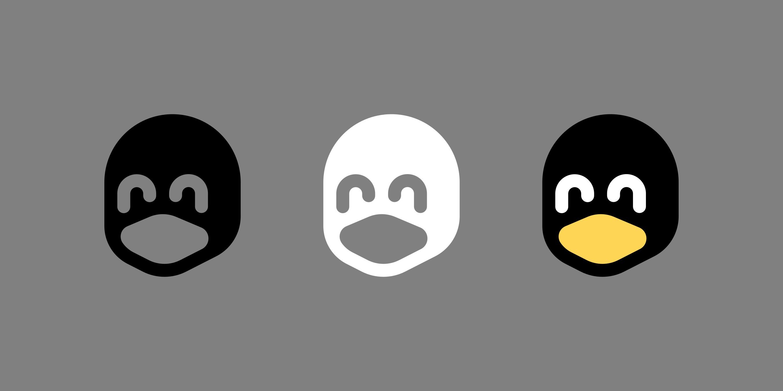
i did go overkill with the simplification, so its easy to see other things. but at small sizes i feel it works better.

473
submitted 8 months ago* (last edited 8 months ago) by sixdripb@lemmy.world to c/linux@lemmy.ml

https://gitlab.com/sxwpb/minimal-tux-icons

These are only meant to help for cases where the full tux is too detailed to display, see examples in the linked README. But the shape also works well for single fill cases, like in the keychain example. I wouldn't want these to be used when the full tux could be displayed in all its glory instead.

~~One issue I have is I do not know how to license these properly, I wouldn't want them to show up in a trademarked logo or anything, but I would still want them to be freely usable as tux icons anywhere. What do you think?~~

I have chosen the CC BY-SA 4.0 license, thank you for helping me!

19

Hello all, as someone who mainly prefers dark themes but also enjoys black text, I created this semi-light neovim color scheme. https://gitlab.com/sxwpb/halfspace.nvim

The goal was having a theme that uses black text but avoids the eye melting of most light themes. In fact the background color is #808080, which is the midpoint of a monitors brightness. Using such a background comes at a hefty cost of text contrast, thus all chosen syntax colors are kept pretty close to the best possible contrast here which is black text.

Let me know what you think and I know lots of people absolutely despise this type of color combination which I understand, so please be kind in that case.

happy vimming

1
submitted 9 months ago by sixdripb@lemmy.world to c/trap@lemmy.world
1
submitted 9 months ago by sixdripb@lemmy.world to c/trap@lemmy.world
1
thook - crystal vests (open.spotify.com)
submitted 10 months ago by sixdripb@lemmy.world to c/trap@lemmy.world
[-] sixdripb@lemmy.world 3 points 10 months ago

hmm have you tried to restart your shell after installing debugpy?

if running lua= vim.fn.exepath('debugpy-adapter') from nvim command mode doesn't return the path, something prob went wrong with your debugpy install, as neovim can't see the adapter. maybe try reinstalling debugpy from mason, quit nvim and reopen it in a new shell and see if can detect it.
view more: next ›

sixdripb

joined 10 months ago