this post was submitted on 10 Jan 2025
113 points (95.2% liked)
Map Enthusiasts
4735 readers
290 users here now
For the map enthused!
Rules:
-
post relevant content: interesting, informative, and/or pretty maps
-
be nice
founded 2 years ago
MODERATORS
you are viewing a single comment's thread
view the rest of the comments
view the rest of the comments
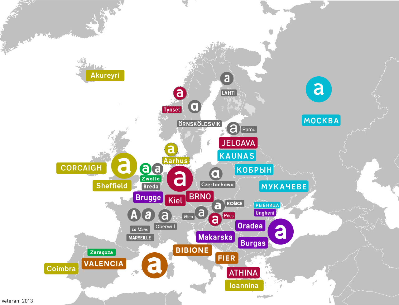
Ahh a fellow Czech road nerd
Edit: you'll like this - this was the old pre-2001 font (I've forgotten the name tho)
Universal Grotesk. Still in use in Slovakia.
What is your opinion on lowercase/uppercase and closest/farthest at the top?
Also I don't really like Grotesk as a transport typeface, it's too bold+curvy...
The kerning on the "Od" there feels too loose to me.
I think it would be alright in uppercase. The problem is that lowercase height is barely above half of uppercase, as opposed to most display fonts.
What do u think about the British font?
In terms of British transport fonts, nothing beats Johnston but that already has its place on the Tube. This one is a good silver medalist.
Johnson feels very British
I personally prefer lowercase as it makes the names less uniform in shape therefore better recognisable. I don't have an opinion on the second one though. Also btw I have a feeling the Slovaks now use the Austrian font