this post was submitted on 11 Jul 2023
2970 points (98.7% liked)
Memes
52384 readers
848 users here now
Rules:
- Be civil and nice.
- Try not to excessively repost, as a rule of thumb, wait at least 2 months to do it if you have to.
founded 6 years ago
MODERATORS
you are viewing a single comment's thread
view the rest of the comments
view the rest of the comments

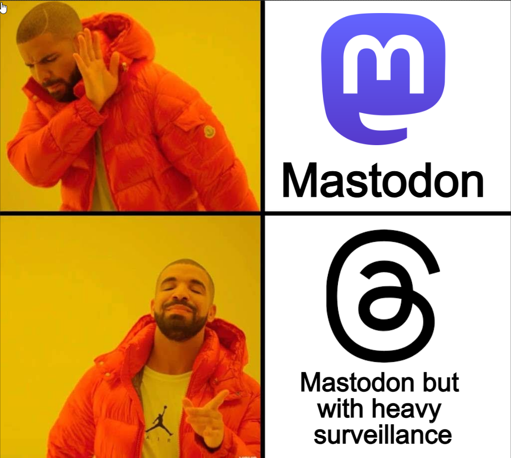
If they want people to use Mastodon, then make it user-friendly and easy for the general public. I downloaded it, tried it, and was lost/confused on the whole server/instance thing and finding communities etc. Whereas Threads is pretty straight forward, it's just a Twitter clone. User experience is more important than privacy to the general public and developers need to realise you can't compromise user experience/ease of use/accessibility.
Ribbit
I've never tried it. Is it really more confusing than Lemmy?
Nah, Mastodon is a lot slicker and more robust in my experience so far (been on there less than a year, but still).
I think the "confusion" is just from having to pick an instance although iirc they made mastodon.social the "default" one for people who didn't want to choose, so maybe that hurdle is gone now, not sure.
I thought mastodon.social was closed to new accounts for aaages now
Still looks like it's the default when you sign up from the mobile app, but both my accounts are on tiny servers so I'm far from an expert here 😅
Might've just been around when I started. I think they were struggling with everyone signing up there at the time. I went to mas.to instead
They are about comparable, once you understand the instances it's pretty straightforward. But I'm ngl, I was confused at first. I'd made my first Mastodon account in 2018! And didn't use it till recently because I didn't understand it for the longest.
I don't use it either, but I guess someone from your instance has to follow someone on another instance before you see content from there…? Maybe someone else can chime in. I just get this stuff third-hand from reading things other people say and listening to nerdy podcasts.
If you use the official Mastodon app, or an instance that has disabled it - you are unable to see the Federated timeline, which is why you would only see the Local timeline - IE things the people on your instance are sharing or following.
The federated timeline is a chronological stream of everything. A bit fast, but kinda magical in a way because I discover so many people just by spending 10-15 minutes combing through it during my visit each day.
I've also started following the same celebs/orgs that I used to follow on other social media.
And most importantly, I control what I see - not some algorithm funneling me into a partisan view of the world, which is a massive part of the issue with Twitter and Facebook and their relationship to current political situations.
Thanks for clarifying!
I'm genuinely curious - what do people find confusing about Mastodon? What could be improved?
I was a little confused by Lemmy at first, but downloading and setting up the Mastodon app seemed super simple and straightforward. I've never been interested in short form text content like this, and couldn't find anything I thought was interesting on the platform, but I didn't feel confused.
Would love to hear what people find annoying/confusing as I'd love to be able to help create content etc for anything that's holding people up. Twitter owns too much social/mental weight for people and Meta is no better - would love to find a way to help move people towards something like the Fediverse.
This is, ultimately, a sad truth that, in my bleaker moments, makes things feel hopeless. However, it can be addressed by improving UX, I suppose, in a pareto-efficient way that hopefully doesn't simultaneously compromise privacy, which does seem possible.
It seems this was meant to be a response to the parent comment. Or maybe you've done that intentionally to highlight the need for improved UX 😅
Tbh I don't think it matters all that much. Exclusivity is cool. Plus reddits idea of UX is literally just plastering advertisements all over your feed. Seems pretty easy to beat that out in the long run, it'll just take some time to catch up. They had a 15 year head start
Lol yup, true… definitely unintentional. I'm used to RES and being able to collapse / navigate comment chains with keyboard shortcuts
I wonder if there's anything analogous for Lemmy 🤔 I suppose the analogous thing would be to just directly add these as features to the frontend
Not sure but there's like 20 different apps and web apps in various states of development, along with Lemmy itself. I'm sure it'll come sooner rather than later.
Somebody recommended Alexandrite to me recently
Woah, didn’t know there was even one web app in development as I would have thought they’d just modify the Lemmy source code directly. I suppose that would take way longer to merge and be more controversial, too, than just writing one’s own front end
Nifty