I prefer flex
Is this a new CSS attribute?
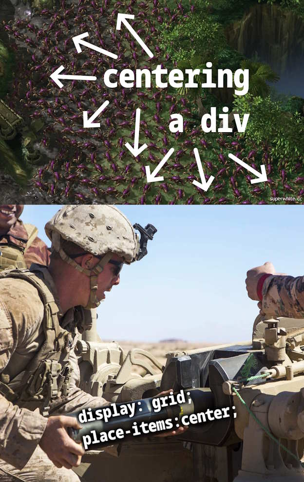
CSS grids are a godsend.
Put it in another div, make that one display:flex;justify-content:center;
Now do html mail!
There is actually an approach which makes this reasonably easy: https://mjml.io/
That's actually cool. I have to remember it next time I have to deal with html mail.
I'll pray for you that it doesn't come to that!
set margin:auto to your div, and call it a day, no need of flex/grid whatever...
I only do webdev occasionally and yeah, I've noticed this tendency that I want to put everything in a CSS grid. At this point, I'm worried I end up with a layout that's about as responsive as the early-2000s table layouts. 🙃
grid and responsiveness are not antithetical. I mean the concept of grid had been around for like a decade, see bootstrap.
Yeah, I've done responsive grids before. Problem is, I'm currently working on a single-page web music player and it's so easy to just nail all the UI elements down. Like I might want to have the play button always appear to the left of the playback bar. But that obviously can't reflow naturally on smaller screens. Although reflowing that example won't look good either.
I guess, I'm still figuring out, if I ever actually want things to reflow. I might just need to define static rules, so that on a small screen, the play button should appear in a different grid cell, next to the previous/next buttons, for example...
Grid is made for responsive design.
If you're not familiar with grid, stick with flex, which kinda just works but doesn't have the strong control/structure as grid.
It's fine, my entire website is built on ~~rock and roll~~ grids.
Programmer Humor
Welcome to Programmer Humor!
This is a place where you can post jokes, memes, humor, etc. related to programming!
For sharing awful code theres also Programming Horror.
Rules
- Keep content in english
- No advertisements
- Posts must be related to programming or programmer topics
