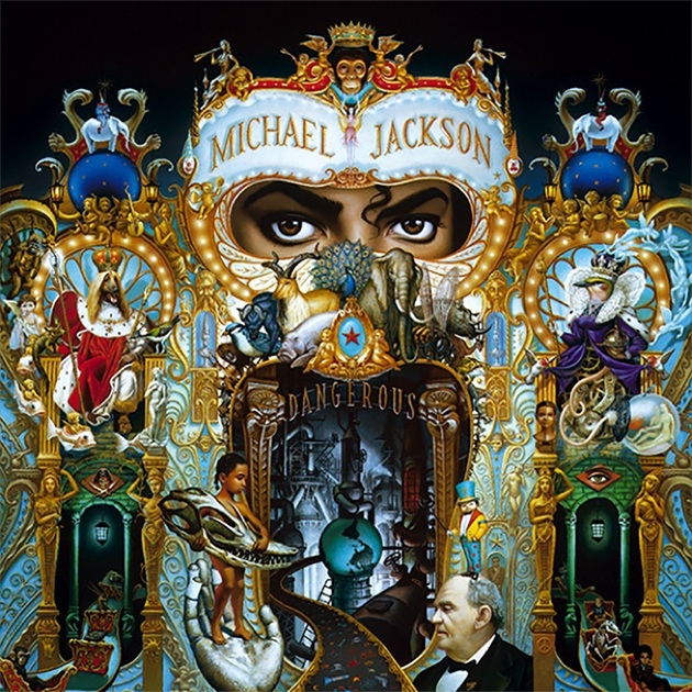
Now is the time for maximalist style!
Honestly, fuck yeah. I would love some old timey style labeling with way too much detail in every single element.
https://bygonetheatre.files.wordpress.com/2014/10/img_0002_33082805_std.jpg?w=600
Packaging in the ['90s and] '00s [were] all about maximalism. Way too much writing and images all over huge plastic packages.
Graphic designer logic is all about following the professional gulf stream while not giving a shit what the fish thinks.
It was infinitely better.

"Ew, it's painted! Gross!" — some professional graphic designer
Wow! That is neat!
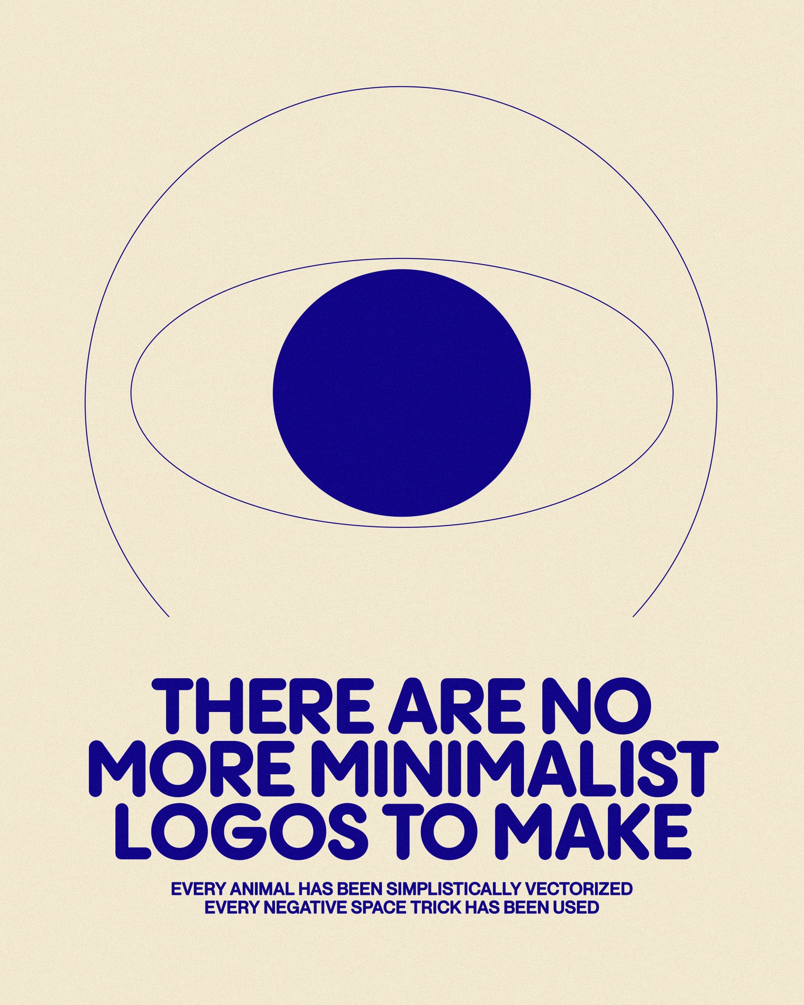
"New AI model discovers 18000 new minimalist logos."
"...and 3000 of the biggest companies have already started using them."
You mean the 6 biggest companies and their 2994 wholly-owned subsidiaries?
Those are the ones, the ones on the conglomerates_to_avoid.jpeg
Logos should now be infinitely zoomable with differing levels of meaning depending on the depth.
Google Mandelbrot set (or other fractals)
Holy hell
Thanks. I was around when they gained public popularity in the early 80s.
Logos should now be ML models generating endless video sequences
I don't know what you mean but I think it would do well at the IPO
That's just the CBS logo
As it said, there’s no new minimalist logos to be made.
50% CBS, 50% Rede Globo.
Lol
“I can’t believe it. I’m a minimalist logo”
-Mike Wazowski
internet funeral
ㅤㅤㅤㅤㅤㅤㅤㅤㅤㅤㅤㅤㅤㅤㅤㅤㅤㅤㅤㅤㅤㅤㅤㅤㅤㅤㅤㅤart of the internet
What is this place?
• !hmmm@lemmy.world with text and titles
• post obscure and surreal art with text
• nothing memetic, nothing boring
• unique textural art images
• Post only images or gifs (except for meta posts)
Guidlines
• no video posts are allowed
• No memes. Not even surreal ones. Post your memes on !surrealmemes@sh.itjust.works instead
• If your submission can be posted to !hmmm@lemmy.world (I.e. no text images), It should be posted there instead
This is a curated magazine. Post anything and everything. It will either stay up or be lost into the void.
