-9
you are viewing a single comment's thread
view the rest of the comments
view the rest of the comments
this post was submitted on 19 Aug 2023
-9 points (42.9% liked)
Firefox
17303 readers
8 users here now
A place to discuss the news and latest developments on the open-source browser Firefox
founded 4 years ago
MODERATORS

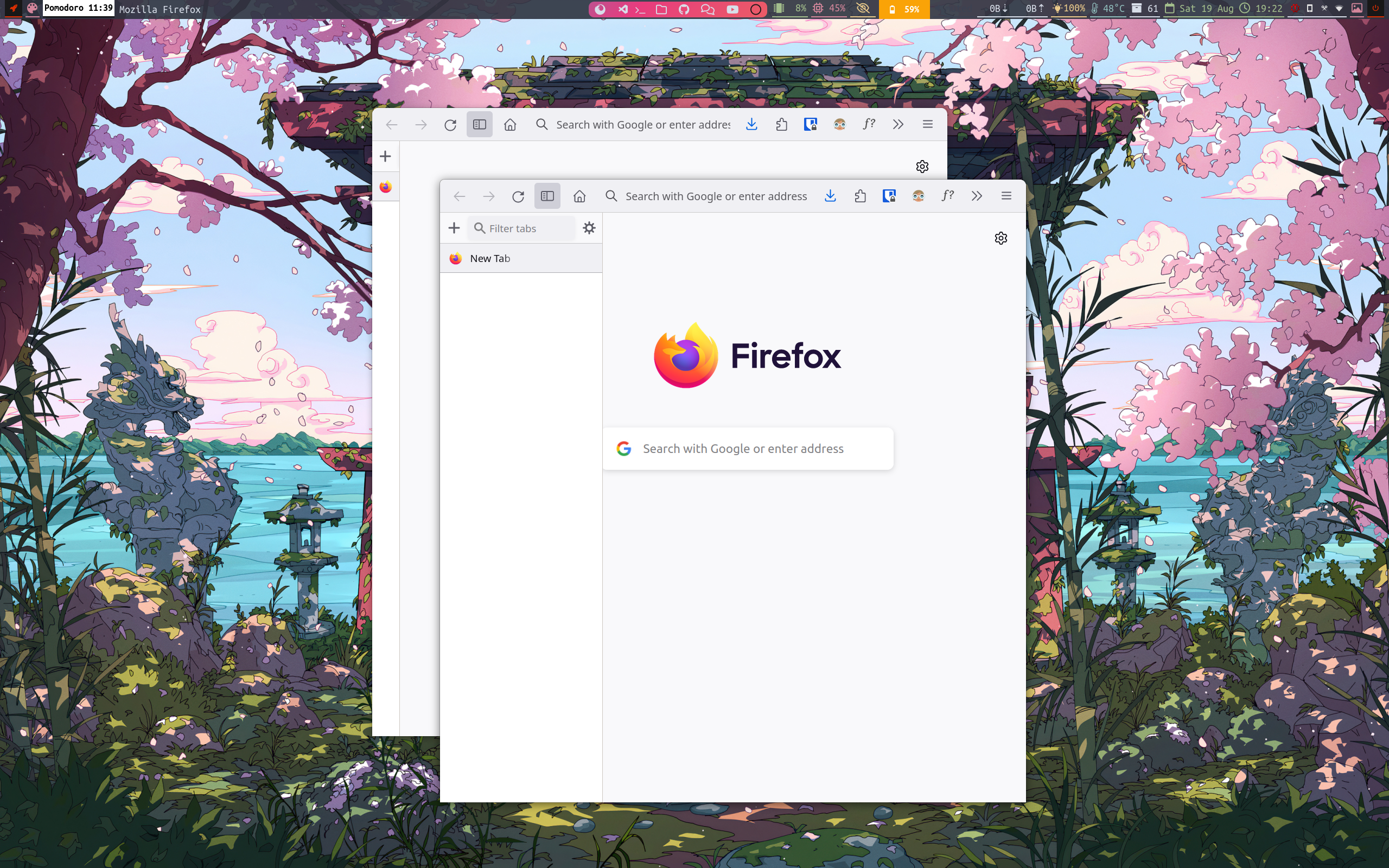
And I've never looked at Firefox's tab bar and thought, this UI element really needs to occupy a lot more screen space.
The chunk of screen space lost to that tabs window wouldn't be as big a deal if the windows were maximised, but there's no button for that now either.
I don't think the missing maximise button is intentional. They seem to be using a minimal (Linux) window manager and it's quite common for those folks to use keyboard shortcuts for maximising, closing etc., so they probably didn't have those window buttons even before starting that redesign...
@Knusper @zurohki
I am using a tiling window manager so keybaord shortcut for every thing.
I can just make it visible just by adding few lines.
Yeah, I hate this redesign, maybe that's why Mozilla stuck with the design that works?
They probably don't want to go down the road of having to have a separate UI for every DE. There's DE-specific browsers for people that care about that.
Don’t put this look on gnome apps lol, they look way better than this.
@TeryVeneno @Lucia
Definitely, If i can develop this in two days, then it shouldn't be as good as gnome apps, which is being developed and designed by industry expert. So no worry over there, you gnome app wont be hurt.
I don’t think you can see this on mastodon, but you were kind so take an upvote.
@TeryVeneno this is all we can give to strangers KINDNESS 😄
Judging by your comment history, you use Linux, so here's a neat trick:
Hold down the Alt-key, then you should be able to drag windows from any of their pixels. If that isn't working, try the Meta/Windows-key.
And if you do the same, but with right-click+drag, it should resize the window.
...but yeah, if we're genuinely proposing this as Firefox's new design, there should still be regular drag space.
You can move windows by holding the meta key. They got rid of the space between extensions and the url bar but that area is also draggable.
@Lucia Its not to make it look like something else, the screens are become wider and not taller, and it make more sense to move the the tab bar to side (vertical tab bar).
I hide the CLOSE, MINIMIZE & MAXIMIZE button as i am using Sway (a tiling window manager).
And to move, we can just press the mod button (CMD on macs and window logo button on keyboards) then just press the left mouse click on firefox to move screen.
@Lucia i was on gnome for a year before switching to sway, so I guess that's the reason of it being looking up like gnome.
As u want tabs to under address bar, it can be achieved, if you are interested I can try to implement it.