The scaling of the vertical axes is bugging me :(
I was wondering how I'd missed so many sci fi movies until I saw your comment...
Oh I didn't even notice that. Yeah, that's bad.
Yeah. That's just awful. Wow.
The lack of decades on every x axis other than the bottom bothers me. This is not a cool guide.
Normally that indicates that all the x axis are the same. If that's not true here, then that's an issue. But I don't see any indication that it's not.
The axis being so far away, even if they are all the same, makes it difficult for the reader to line up where the peaks are, though some are easy to get from contextual clues (~1945 for War movies for example).
Yeah. Good point. I've seen this with just two stacked graphs and not minded. But it makes the trends in the top graphs here pretty inaccessible.

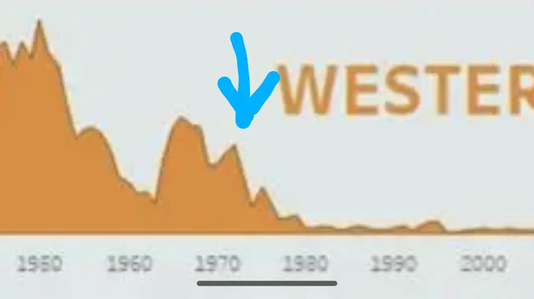
Blazing Saddles came out in 1974 and practically killed a genre.
So which category are the marvel/"every obscure comic character gets their own file series" films?
Fantasy? Thriller?
MCU should probably get its own graph, which starts as a line going straight up.
Action
What different thriller/horror? They same?
One of them has zombies, the other has zombies that dance.
Both contain Vincent Price
"Psycho" is a thriller. "Halloween" is horror.
Think of thrillers more like rollercoaster rides - they’re fun because they’re exciting and sometimes scary
Horror is more like haunted houses, they’re fun because they’re scary, which is sometimes exciting
This is the interesting thing about genres - they’re often abstract and can blur definitions easily. The same way we don’t consider a hot dog or a pop tart a sandwich, even though you can often find the definition of a sandwich in each.
Horror is blood and gore. Thriller is scary (ghosts etc) but no (or only little) blood.
Friday the 13th vs gone girl.
Can you please slow down with the reposted drivel? This one even got removed by the mods on Reddit, FFS!
Now do a heatmap of jaccard indices
I wish they would make some new good westerns. It is like all new stuff that is made is so 'remake' or 'next number'.
Cool Guides
Rules for Posting Guides on Our Community
1. Defining a Guide Guides are comprehensive reference materials, how-tos, or comparison tables. A guide must be well-organized both in content and layout. Information should be easily accessible without unnecessary navigation. Guides can include flowcharts, step-by-step instructions, or visual references that compare different elements side by side.
2. Infographic Guidelines Infographics are permitted if they are educational and informative. They should aim to convey complex information visually and clearly. However, infographics that primarily serve as visual essays without structured guidance will be subject to removal.
3. Grey Area Moderators may use discretion when deciding to remove posts. If in doubt, message us or use downvotes for content you find inappropriate.
4. Source Attribution If you know the original source of a guide, share it in the comments to credit the creators.
5. Diverse Content To keep our community engaging, avoid saturating the feed with similar topics. Excessive posts on a single topic may be moderated to maintain diversity.
6. Verify in Comments Always check the comments for additional insights or corrections. Moderators rely on community expertise for accuracy.
Community Guidelines
-
Direct Image Links Only Only direct links to .png, .jpg, and .jpeg image formats are permitted.
-
Educational Infographics Only Infographics must aim to educate and inform with structured content. Purely narrative or non-informative infographics may be removed.
-
Serious Guides Only Nonserious or comedy-based guides will be removed.
-
No Harmful Content Guides promoting dangerous or harmful activities/materials will be removed. This includes content intended to cause harm to others.
By following these rules, we can maintain a diverse and informative community. If you have any questions or concerns, feel free to reach out to the moderators. Thank you for contributing responsibly!
