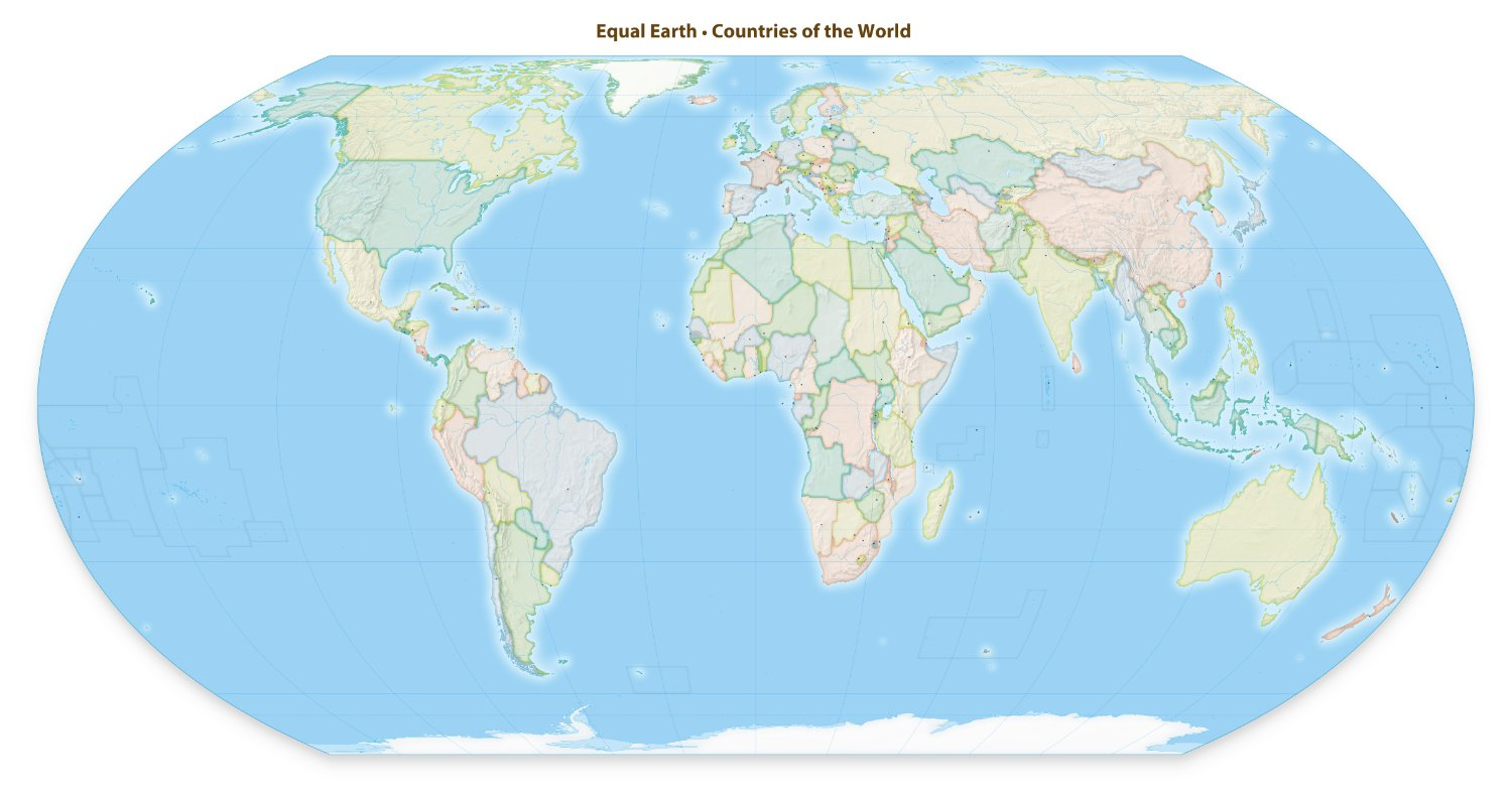
Any map depicting UTC0 in the centre and not the international date line in the centre is unequal.
-t Pacific nations.
The rules for posting and commenting, besides the rules defined here for lemmy.world, are as follows:
Rule 1- All posts must begin with YSK.
All posts must begin with YSK. If you're a Mastodon user, then include YSK after @youshouldknow. This is a community to share tips and tricks that will help you improve your life.
Rule 2- Your post body text must include the reason "Why" YSK:
**In your post's text body, you must include the reason "Why" YSK: It’s helpful for readability, and informs readers about the importance of the content. **
Rule 3- Do not seek mental, medical and professional help here.
Do not seek mental, medical and professional help here. Breaking this rule will not get you or your post removed, but it will put you at risk, and possibly in danger.
Rule 4- No self promotion or upvote-farming of any kind.
That's it.
Rule 5- No baiting or sealioning or promoting an agenda.
Posts and comments which, instead of being of an innocuous nature, are specifically intended (based on reports and in the opinion of our crack moderation team) to bait users into ideological wars on charged political topics will be removed and the authors warned - or banned - depending on severity.
Rule 6- Regarding non-YSK posts.
Provided it is about the community itself, you may post non-YSK posts using the [META] tag on your post title.
Rule 7- You can't harass or disturb other members.
If you harass or discriminate against any individual member, you will be removed.
If you are a member, sympathizer or a resemblant of a movement that is known to largely hate, mock, discriminate against, and/or want to take lives of a group of people and you were provably vocal about your hate, then you will be banned on sight.
For further explanation, clarification and feedback about this rule, you may follow this link.
Rule 8- All comments should try to stay relevant to their parent content.
Rule 9- Reposts from other platforms are not allowed.
Let everyone have their own content.
Rule 10- The majority of bots aren't allowed to participate here.
Unless included in our Whitelist for Bots, your bot will not be allowed to participate in this community. To have your bot whitelisted, please contact the moderators for a short review.
Rule 11- Posts must actually be true: Disiniformation, trolling, and being misleading will not be tolerated. Repeated or egregious attempts will earn you a ban. This also applies to filing reports: If you continually file false reports YOU WILL BE BANNED! We can see who reports what, and shenanigans will not be tolerated.
If you file a report, include what specific rule is being violated and how.
You can view our partnered communities list by following this link. To partner with our community and be included, you are free to message the moderators or comment on a pinned post.
For inquiry on becoming a moderator of this community, you may comment on the pinned post of the time, or simply shoot a message to the current moderators.
Our icon(masterpiece) was made by @clen15!
Any map depicting UTC0 in the centre and not the international date line in the centre is unequal.
-t Pacific nations.
I feel like thats why UTC never took off. They should have set 0 in the pacific ocean somewhere and everyone would have been much happier.
This is such a garbage take. There is no way to “show our world as it truly is” in two dimensions. I’m all about showing other projects and orientations. Classrooms should have “upside down” maps and Albert maps for example. But we should also teach that each projection has benefits and drawbacks. I was taught that decades ago. Have we stopped?
The way the world's going, the next accepted projection will be depicted on the backs of four elephants atop a turtle.
Bring on the Wizzards
I do hope we get the luggage....
Why does the map on the website need that draggable divider when both versions show both types of projection?
I was wondering the same thing.
It's a bit hard to find out where it actually originated from and who's behind it. Judjing by their social media handlers, it's a marketing agency Hello Makeda. Maybe it's just me, but I don't trust marketing agencies to be good judges on geographical projects.
Just want to point out... their "equal" and "correct" map is missing New Zealand...
You mean the homepage infographic? Thats not the map. If you click download you can get accurate full maps based on this projection.
Why don't they just put the actual map on their site? The video and slider map make usa canada and mexico look like islands..
There's a big "Download" url: https://equal-earth.com/ here's the standard english one https://www.equal-earth.com/Equal-Earth-Map-0.jpg
(Maps missing New Zealand is a meme)
Since this article gave you everything except the one thing you want to see, here's what the Equal Earth projection looks like
Yes, it is an awful website with an awful promotion video. Sizing the countries down but not connecting them and not showing you the world map as it would look like in total is absolutely not furthering the cause. I'm so mad I'm not sure I even want to sign the petition to be honest. Granted, my school atlas did not have the mercator projection.
This will never happen as long as Big Greenland pulls the strings of power in the cartography world.
And they're very big. Have you looked at a map lately? Do you expect tiny little Africa to stand up to that?
It’s time the U.S. deals with big Greenland once and for Oil.
I mean the problem with any projection of earth onto a 2d simplified shape surface is that it will be inherently distorted. The Mercator projection is scaled properly towards the equator but has to scale upwards more and more toward the poles to be able to fit the given area.
Even their own map, which for some reason isn’t shown in either the video or on the main page, isn’t accurate either. It’s better but is also warped in its own way, it would be nice if they had a little blurb that says something to that effect.
Here’s the actual map projection they are pushing for; https://equal-earth.com/equal-earth-projection.html
Fuck that. Let's go for the euler spiral.
It seems like the kind of thing that would give rise to the ~
Earth movement
In color
i think the best solution (besides globes which are impractical on screens/posters) is having no standard, expose kids in school to 3 or 4 different projections so they learn there's no standard and all protections are as valid and all with drawbacks and advantages.
still not as aesthetic as Waterman butterfly projection
(and relevant XKCD)
Mercator distorts landmass to fit the grid, so it is good for navigation, simply draw a straight line between two points and follow it. Also, the plea on that site is just...weird. Africa is not taken seriously because it is displayed too small on maps - what? It is a large, chunky continent that can be compressed without too much detail loss - Europe, not so much.
The Mercator projection was great for navigating oceans, baring remain correct. There are thousands of other map projections that do a better job preserving size, shape, directions, and distances. Any projection will be a tradeoff between these.
As far as I know the Mercator projection has mostly fallen out of use in education, and I don’t think there’s any standard that requires it anywhere. So I’m not sure exactly what this is about.
Faithfully projecting a globe onto a flat surface is impossible and all projections have to balance a number of compromises. Mercator retains compass directions and the shapes of land masses but entirely sacrifices relative scale between equatorial regions and polar regions. This makes it great for navigating a 17th century vessel. Other projections strike a different balance, like this one, and sacrifice compass direction and land mass shapes in order to perfectly retain scale. On this map, my little Arctic island looks like someone stepped on it.
IMO a balanced projection will compromise on all the nice properties a projection can have, and if that isn't acceptable, then get a globe.
CMV: this movement only matters to stupid people, and does not qualify as something "I should know".
maybe a little abrasive in tone but i don’t totally disagree, this is kind of fucking dumb and i don’t understand why i’m seeing this everywhere rn.
mercator hasn’t been ubiquitous in decades and when it is used today there’s usually an actual reasoning, however valid one decides it to be.
what the fuck are these people talking about?
a campaign for this? what, are we going to campaign to cease the use of subway maps next because they give a dishonest sense of size and scale of metros?
this feels like weird distraction bait from things that actually matter.
By signing the petition you take a stand against a false narrative that downplays Africa’s vast size and diversity as the second-largest continent, reducing its perceived importance in global politics and economics. You can correct the narrative.
I'll be real here, I have no idea what these people are talking about. The way Africa looked on maps has never had any bearing on my or probably anyone's thinking of how important the continent is in global politics or economics. If someone thinks "country/continent looks small so they must be unimportant," they are either a child or a fool. Or both.
Whatever map that uses Eurasia rather than pretend Europe is it's own continent is fine by me
DYMAXION MAP OR GTFO
EDIT: details
It has less distortion of relative size of areas, most notably when compared to the Mercator projection; and less distortion of shapes of areas, notably when compared to the Gall–Peters projection. Other compromise projections attempt a similar trade-off.
More unusually, the Dymaxion map does not have any "right way up". Fuller argued that in the universe there is no "up" and "down", or "north" and "south": only "in" and "out".[9] Gravitational forces of the stars and planets created "in", meaning "towards the gravitational center", and "out", meaning "away from the gravitational center". He attributed the north-up-superior/south-down-inferior presentation of most other world maps to cultural bias.
Firstly, I do think that projections which enlarge Europe and north America relative to the global south are a problem and every curriculum should include education about how this happens and what the world really looks like.
But also, kinda funny how this project is very specifically about fairness for Africa. Why not include south America in there too?
Firstly, I do think that projections which enlarge Europe and north America relative to the global south are a problem and every curriculum should include education about how this happens and what the world really looks like.
Honestly, at least in school you should use a globe to begin with. It is the best projection there is. I'm also pretty sure there are online "globes" that you can turn any way you want. Using a 2D projection is mostly unnecessary in education.
Okay... but doesn't this just introduce the issue of flat maps distorting anything to the east or west of center in a different way?
It's now trivial, in 2025, to depict the world as a 3D shape, this is coming a few decades after it matters, imo.