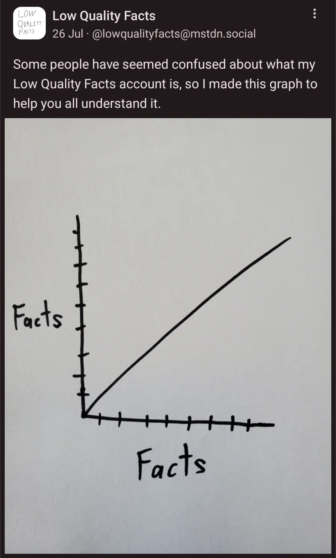
The amount of facts per fact increases as the facts increase. Pretty self explanatory.
The curve is clearly concave-down, indicating that, in fact, the number of facts per fact decreases as facts increase.
After being inundated with lots of facts your ability to perceive more facts drops. It's actually a very high quality graph and therefore the account is misleading.
More facts per fact. That's a Cave Johnson promise.
I know that this means that facts can be mapped onto a mobius* strip. Why or how, I don't know. But I do know that.
It's Morbin' time
Technically it’s Möbius, not Mobius. The ö is not pronounced like o but more like the u in burger or the i in dirt. (This is a general rule for the letter ö, if you want to pronounce it closer to the original German.)
Well, before I edited it it read morbious, so I'm saying good enough
I've always told people to sound momentarily disgusted whenever your see it.
Köln becomes K-errrh-ln, for example
It's also really hard for me to switch between languages at the minute because both my English and German keyboards are active on my phone so as soon as I spell Köln correctly, my keyboard thinks "oh scheiße, es ist Zeit für Deutsch!"
Curiously, my own personal shits given per shits given graph looks exactly the same
Microblog Memes
A place to share screenshots of Microblog posts, whether from Mastodon, tumblr, ~~Twitter~~ X, KBin, Threads or elsewhere.
Created as an evolution of White People Twitter and other tweet-capture subreddits.
Rules:
- Please put at least one word relevant to the post in the post title.
- Be nice.
- No advertising, brand promotion or guerilla marketing.
- Posters are encouraged to link to the toot or tweet etc in the description of posts.
Related communities:
